

Next.js
Integrate the image editor in a Next.js application with the App Router or the Pages Router.
In Next.js, the image editor runs in the browser. You load the React component ImageEditor with next/dynamic and ssr: false.
Installation
npm install @layermetry/media-editorThe package needs no change to next.config.js.
Requirements
- Next.js 14.2 with React 18.2. The examples on this page run with Next.js 14.2.15 and React 18.2.0, in both routers.
- A license key. See License keys.
Usage
Create a page in the App Router. Mark it with 'use client', and load the component with next/dynamic.
'use client';

import dynamic from 'next/dynamic';

const ImageEditor = dynamic(
  () => import('@layermetry/media-editor/react').then((mod) => mod.ImageEditor),
  { ssr: false },
);

export default function EditorPage() {
  return (
    <div style={{ position: 'fixed', inset: 0 }}>
      <ImageEditor
        licenseKey={process.env.NEXT_PUBLIC_LAYERMETRY_LICENSE_KEY!}
        onExport={(file) => console.log(`Exported ${file.name}`)}
        onClose={() => console.log('The editor was closed')}
      />
    </div>
  );
}
Put the key in .env.local. Next.js gives browser code only the variables whose names start with NEXT_PUBLIC_.
NEXT_PUBLIC_LAYERMETRY_LICENSE_KEY=YOUR_LICENSE_KEYFor each complete app/editor/page.tsx on this page, use an existing Next.js App Router TypeScript project. Install the package above, replace that file with one complete example at a time, and replace YOUR_LICENSE_KEY with a key valid for your origin. Keep your root app/layout.tsx. Start the development server:
npm run devOpen http://localhost:3000/editor (or the port printed by Next.js). Initial Usage logs export and close callbacks in the browser console. Later Prop excerpt blocks show only the setting or callback being discussed. Keep the imports, required props, helpers, and surrounding UI from the complete file below each excerpt.
Relative /api/... requests need matching App Router route handlers under app/api/.../route.ts, or a reachable backend behind those addresses. The development server does not create handlers for the snippets. Each complete file names its request method, fields, and expected response. Replace example.com URLs and provider credentials. Supply your own pictures and sticker files; create multiple pages when an example needs them. For the Pages Router, use the same client code in pages/editor.tsx and provide API routes under pages/api/.
Launch from a button
Show the editor when the user asks for it, and hide it when onClose runs.
'use client';

import { useState } from 'react';
import dynamic from 'next/dynamic';

// Load the editor in the browser only, and only when this page needs it.
const ImageEditor = dynamic(
  () => import('@layermetry/media-editor/react').then((mod) => mod.ImageEditor),
  { ssr: false },
);

async function uploadDesign(file: File) {
  const body = new FormData();
  body.append('design', file);
  const response = await fetch('/api/designs', { method: 'POST', body });
  if (!response.ok) throw new Error(`Upload failed: ${response.status}`);
  console.log(`Uploaded ${file.name}`);
}

export default function EditorPage() {
  const [isOpen, setIsOpen] = useState(false);

  if (!isOpen) {
    return <button onClick={() => setIsOpen(true)}>Create a design</button>;
  }

  return (
    <div style={{ position: 'fixed', inset: 0 }}>
      <ImageEditor
        licenseKey={process.env.NEXT_PUBLIC_LAYERMETRY_LICENSE_KEY!}
        onExport={(file) => {
          uploadDesign(file).catch((error) => console.error(error));
        }}
        onClose={() => setIsOpen(false)}
      />
    </div>
  );
}
The editor code is downloaded when the user presses the button, not when the page opens.
Configuration
Pass configuration options as props. Options lists every prop.
Layout and sizing
width and height size the editor's container; omitted values fill its parent.
Use numeric values for pixels, such as width={390}, or CSS strings, such as height="80vh". The complete example below switches between narrow and wide containers and adds a fullscreen button.
Container sizing
A numeric size is in pixels. A string accepts any CSS size, such as '80vh' or 'calc(100vh - 64px)'. Both props default to '100%'. Give the parent a height when you use these defaults. The editor measures its container continuously and adjusts when that container changes size.
Compact layout
The editor uses the compact layout below 960 pixels and the regular layout from 960 pixels. The container determines the layout, including in a narrow desktop side panel.
The top bar contains Close, Undo, Redo, zoom, and Export. The page list sits below the canvas. The bottom dock contains Media, Text, Elements, Shapes, Stickers, Background, Effects, Resize, and Templates. Tools open in a panel above the dock; drag a panel up to expand it or down to close it. Selecting an element replaces the tools with selection actions.
Fullscreen mode
The editor has no fullscreen button. Call requestFullscreen() on its container after a user click or key press. Exit fullscreen before removing that container. To fill the browser window without fullscreen, use position: fixed and inset: 0 on the parent.
Editing outside canvas
Selected or dragged items remain visible in the gray area outside the canvas, with their outside parts dimmed. Resize and rotation handles remain usable. Deselecting an item clips it at the canvas edge. The export contains only the canvas.
| Behavior | What the user sees |
|---|---|
| Canvas snapping | Matching item and canvas edges, or their centers, align within 6 screen pixels and show a guide. |
| Disable snapping | Hold Alt, or Option on a Mac, while dragging. |
| Drag return | With less than 8 screen pixels left inside on either axis, the item returns to its last visible position over 200 ms. |
| Reduced motion | The item returns immediately. |
| Outside at drag start | An item that never enters the canvas stays where it is released. |
| Edge markers | Select the nearest outside item; repeated presses cycle through items on that side. |
| Move into canvas | The selected outside non-background item moves inside with the smallest movement; oversized axes are centered. |
| Fit | Square canvas corners with at least 20 screen pixels of surrounding space. |
Snapping aligns with the canvas, not with other items. Move into canvas is in the right-click menu, respects position locks and takes one undo step. Markers do not appear in exported files.
See Canvas editing for the recovery steps.
Theming
http://localhost, http://127.0.0.1 and http://[::1] are allowed for development on your own computer. Relative paths and storage keys must resolve to HTTPS outside local development. See Address security.Theming changes the editor's colors, control fonts, corners, and logo. Canvas content keeps its own styling.
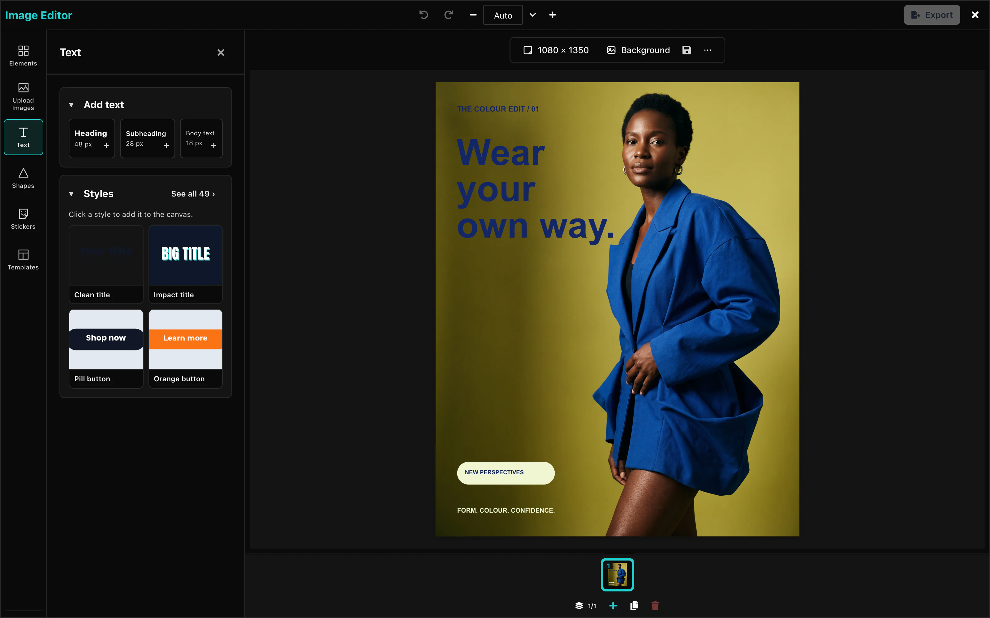 View full size
Apply these settings to match the screenshot:
<ImageEditor
  theme={{
    primary: '#7c3aed',
    secondary: '#7c3aed',
    surface: '#f5f3ff',
    border: '#ddd6fe',
    textPrimary: '#1e1b4b',
  }}
  typography={{
    heading: 'Georgia, serif',
    body: 'Georgia, serif',
    mono: 'Menlo, monospace',
  }}
  radii={{ sm: '2px', md: '4px', lg: '6px', full: '9999px' }}
  logo={LOGO}
/>Colors
theme sets the colors of the editor. Name only the roles you want to change. Every other role keeps its default.
<ImageEditor
  theme={{ primary: '#7c3aed', secondary: '#7c3aed' }}
/>Default: the Layermetry palette in the table below. A value is a CSS hex color, or a color name from the table, such as gray.200.
| Role | What it colors | Light | Dark |
|---|---|---|---|
primary | Brand color: the active tool, the selected page, and the add buttons | #26D0CE | #26D0CE |
secondary | The Export button and other filled buttons | teal | teal |
tertiary | Recessed areas and track backgrounds | cyan | cyan.300 |
accent | Highlights and active rings | #26D0CE | #26D0CE |
brand | Brand badges | #26D0CE | #26D0CE |
background | The background behind everything | white | gray.900 |
surface | Top bar, side panels, and sheets | gray.50 | gray.800 |
overlay | Pop-up menus and hover fills | gray.200 | gray.700 |
border | Panel edges and input outlines | gray.300 | gray.600 |
divider | Thin lines inside panels | gray.200 | gray.700 |
textPrimary | Labels, values, and headings | gray.900 | gray.50 |
textSecondary | Help and caption text | gray.700 | gray.400 |
textMuted | Placeholders and unavailable labels | gray.400 | gray.500 |
textOnPrimary | Text on a brand-colored button | white | gray.900 |
textOnSecondary | Text on a secondary button | white | gray.900 |
textInverse | Tooltips | white | gray.900 |
focus | The keyboard focus outline | #26D0CE | #26D0CE |
hover | The color under the pointer | #1FB8B6 | #1FB8B6 |
active | A control while it is pressed | #26D0CE | #26D0CE |
selected | The chosen tool or tab | #26D0CE | #26D0CE |
disabled | Unavailable controls | gray.200 | gray.700 |
image | Picture items | green | green |
text | Text items | yellow | yellow |
shape | Shape items | teal | teal |
video | Video items | #26D0CE | #26D0CE |
audio | Audio items | purple.50 | purple.50 |
success | Confirmations | green | green.400 |
info | Information messages | cyan | cyan.300 |
warning | Warnings | yellow | yellow.300 |
danger | Delete and other actions that remove things | red | red.400 |
muted | Less important parts of the editor | gray | gray.500 |
shadow | Shadows under panels | gray.500 | black |
highlight | Search highlights | yellow.100 | yellow.200 |
link | Links | #26D0CE | #26D0CE |
The video editor accepts the same names and one more, mediaSelected. The image editor ignores mediaSelected, so one color object can serve both editors.
Customization Studio
With showThemeCreator set to true, the palette button opens the Customization Studio. Choose colors, fonts, corners, icons and tool visibility there. Copy settings copies one JSON object. Download .json saves it as editor-settings.json.
The Settings tab starts from your supplied theme, logo, data icons and UI settings. It includes your edits. The file contains no license key or callbacks. React component icons are omitted because the file stores data only. Closing the Studio restores your supplied settings. Copy or download changes before closing it.
Logo edits appear immediately in the editor’s top bar while the Studio is open. Clearing the field removes the logo from the preview. Closing the Studio restores your supplied logo.
The Bar tab previews the real toolbar for each item type. Nothing selected previews the page bar. For a selected-item control, change its label, choose Default, Icon only, Words only or Both, move it up or down, or hide it. These settings are saved in ui.selection.
Tools marked (off by default) enter the rail order only when you enable them. Reordering the rail does not enable those tools. Reset restores the settings you supplied when the Studio opened.
Apply the settings file
Import the downloaded JSON and spread the whole settings object into the options from your existing host.
import settings from './editor-settings.json';

// Add this spread to the existing editor component.
<ImageEditor {...settings} licenseKey="YOUR_LICENSE_KEY"
  onClose={handleClose} />
The image settings file does not contain enableThemeToggle; the image editor has no user-facing light/dark switch. darkMode selects the base palette for any omitted theme roles.
icons accepts IconData: { svg: '<svg …></svg>' } or { url: '/icons/plus.svg' }. SVG text is limited to 8,192 UTF-8 bytes and cannot contain a script tag, JavaScript URL or event-handler attribute. Icon addresses use HTTPS, image data URLs, relative paths or HTTP on localhost, 127.0.0.1 or [::1]. A refused standard icon keeps the built-in icon with one warning. Custom actions accept icon data only; the standard icon map also accepts React components.
The JSON file contains icon data. It contains no React components. Your page loads the font files named by typography. See Editor settings for complete files and the settings table.
The Studio is a tool for you, the developer. Its button is hidden by default. Show it in your development build only. Only the value true shows it. Default: false.
<ImageEditor
  showThemeCreator={true}
/>The Studio starts from your supplied settings. Hidden tools are written into ui.toolRail.hidden or ui.dock.hidden. A dark base writes darkMode: true. Reset returns to your supplied theme.
Fonts
typography sets the fonts of the editor's buttons, panels, and menus. Each value is a CSS font-family. Your page must load the font files.
<ImageEditor
  typography={{ heading: 'Georgia, serif', body: 'Georgia, serif', mono: 'Menlo, monospace' }}
/>Default: the editor's own fonts. A key that you leave out keeps its default.
This does not change the fonts that users can pick for text in their designs. See Text.
radii sets the corner rounding of buttons, inputs, and panels, in any CSS length. Default: the editor's own rounding.
<ImageEditor
  radii={{ sm: '2px', md: '4px', lg: '6px', full: '9999px' }}
/>Light and dark mode
darkMode selects the dark palette. Default: false, the light palette.
<ImageEditor
  darkMode
/>With theme, darkMode decides which palette your colors change: roles that you do not name come from the dark palette. The editor has no switch for the user. Your application decides the mode, and can change it while the editor is open.
Logo
logo shows your logo in the top bar. The value is the address of an image: a URL, or a data: URL.
<ImageEditor
  logo="https://example.com/logo.svg"
/>The logo is drawn at 32 × 32 pixels at the left of the top bar, before the title. In the compact layout it is 24 × 24 pixels, in the middle of the top bar. Default: no logo.
UI customization
Use HTTPS for endpointUrl. HTTP is allowed only on your own computer at the loopback addresses.
The ui prop changes which tools the editor shows, in what order, and with which names. It also controls where AI features appear. Without ui, the editor shows its standard tools.
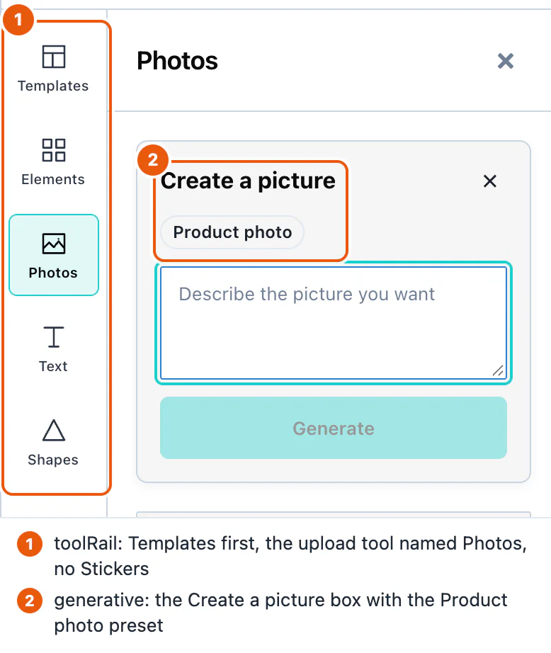
Apply these settings to match the screenshot:
<ImageEditor
  ai={{ endpointUrl: 'https://api.example.com/ai' }}
  ui={{
    toolRail: {
      // Templates first, then the rest in their usual order. No stickers.
      order: ['templates'],
      hidden: ['stickers'],
      labels: { upload: 'Photos' },
    },
    generative: {
      actions: {
        image: {
          label: 'Create a picture',
          presets: [
            { id: 'product', label: 'Product photo', prompt: 'A product photo on a white table, soft light' },
          ],
        },
        // No AI rewriting of text.
        textRewrite: { enabled: false },
      },
    },
  }}
/>Panels
ui.toolRail changes the tool rail on the left, in the desktop layout. ui.dock changes the tool dock at the bottom, in the compact layout. Both take the same three keys:
| Key | What it does |
|---|---|
order | The tools that come first, in this order. The other tools follow in their usual order. |
hidden | The tools that do not appear. |
labels | New names, by tool. The name shows in the tooltip and to screen readers. |
Default: every tool in the order of the tables below, except the two that are off the rail. See Tools that are off the rail by default.
| Rail tool | Name |
|---|---|
upload | Upload Images |
text | Text |
shapes | Shapes |
stickers | Stickers |
templates | Templates |
effects | Effects. Off the rail by default. |
background | Background. Off the rail by default. |
| Dock tool | Name |
|---|---|
media | Media |
text | Text |
elements | Elements |
shapes | Shapes |
stickers | Stickers |
background | Background |
effects | Effects |
resize | Resize |
templates | Templates |
automated | Generate. Shown only when you pass createAutomatedContent. |
With createAutomatedContent, the tool rail also has Generate, with the id automated. Hide it with ui.features.automatedContent: false.
An id that the editor does not know is ignored, and the console lists the valid ids. The Stickers tool also disappears when you pass stickers={{ sources: [] }}. See Stickers and GIFs.
To hide the pages strip, the list of pages with Add page, Duplicate page, and Delete page, set ui.chrome.pages to false. It is hidden in the desktop and the compact layout. Use it for an editor that edits one picture.
<ImageEditor
  ui={{ chrome: { pages: false } }}
/>One ui object fits both editors: ui.chrome accepts timeline, which the video editor reads, and pages, which the image editor reads. Each editor ignores the other key.
Toolbar buttons
The buttons in the top bar and above the page follow the features that you set up. There is no list to change them one by one:
| Button | Shown when |
|---|---|
| Customization Studio (top bar) | showThemeCreator is true. See Theming. |
| Save template (above the page) | You pass onSaveTemplate. See Saving and loading. |
| Save draft (export panel) | You pass onSaveTemplate. |
| Remove Background | A picture is selected. It needs a media server. See Images. |
| Edit with AI, Rewrite with AI | You pass ai, and the feature is not switched off. See AI features. |
The Export and Close buttons are always there.
AI features
ui.generative decides where each AI feature appears. An AI feature appears only when you pass ai. See AI providers.
<ImageEditor
  ui={{ generative: { actions: { textRewrite: { enabled: false } } } }}
/>| Key | Default | What it does |
|---|---|---|
enabled | true | false removes every AI control from the editor. |
actions.<feature>.enabled | true | false removes one feature. |
actions.<feature>.surfaces | the places in the next table | The places where the feature appears. [] means nowhere. |
actions.<feature>.label | the standard name | The name of the button, for example 'Create a picture'. |
actions.<feature>.presets | none | Ready-made requests, shown as buttons in the box. Each has id, label, and prompt. |
contextMenu | the standard menu | false turns off the editor's right-click menu, so the browser's own menu appears. An object with order, hidden, and labels changes the entries of the menu, as for the tool rail. |
The features of the image editor, and the places where each one appears by default:
| Feature | What it does | Places |
|---|---|---|
text | Writes new text. | panel (Text panel), emptyCanvas (right-click on the page) |
textRewrite | Rewrites the selected text. | panel, selection (the toolbar above the page), contextMenu |
image | Creates a picture. | panel (upload panel), emptyCanvas |
imageEdit | Changes the selected picture. | selection, contextMenu |
svgPath | Creates a shape. | panel (Shapes panel) |
ui.features switches all AI generation off with one key: ui={{ features: { 'ai.generate': false } }}.
ui can only remove AI controls. To stop the editor from sending a feature's requests at all, set it to false in ai, for example ai={{ endpointUrl: '/api/ai', imageEdit: false }}. See Per-feature options.
Built-in control lists
On a desktop, one bar above the canvas shows the controls of the selected item, for text, shapes, pictures, stickers, GIFs, labels and several items together. The phone's selection bar uses the same settings. A button shows its current value, for example opacity or font size. When the bar is too narrow, the controls at the end of the default list move into a More menu. Colour, volume, effects and the other value controls open in a panel on the left side. With nothing selected, the bar becomes a page bar with the canvas size, Background, the Save template button when the editor can save templates, the Default locks… button, and a More menu with the lines of the empty-canvas right-click menu.
ui.selection changes the controls of the selected item. The editor has a default list of controls for each type of item. That list is only the starting view. ui.selection is applied after it, so your choice wins. Merge this section into the existing host's ui option.
import type { ImageUiConfig } from '@layermetry/media-editor';

const uiControls: ImageUiConfig = {
  selection: {
    order: ['replace', 'crop'],           // these come first
    hidden: ['delete'],                   // no Delete button
    labels: { replace: 'Swap picture' },  // a new name
    display: { effects: 'icon' },         // a picture only
  },
};
Listed ids come first, in your order, even a control that would wait behind More. The other controls keep their default order. Hidden buttons leave shortcuts and editing actions available. labels renames a control, and the new name is also its tooltip and accessible name. display: 'icon' draws a picture only and keeps the label as the tooltip and accessible name. The desktop bar draws Bold, Italic, Underline, Bring forward, Send backward, Delete as a picture only by default. Set display to 'label' or 'both' to bring the words back. The right-click menu keeps words. Unknown ids are ignored with one warning.
The new ids are replace (a picture), copyStyle and pasteStyle, and group and ungroup for several selected items.
ui.toolbar is still accepted. The bar has no groups now, so the editor translates each group id into the controls that the group held. The group text held font, textAlign and rewriteWithAi. A labels setting for a group has no heading to change, and the order, labels and display of actions (your own buttons) are not applied. The editor prints one console warning that starts with [MediaEditor] ui.toolbar:. Use ui.selection instead.
See Default lists for the real default list of every type of item, and Control ids for the typed id unions.
Tools that are off the rail by default
Effects and Background are not on the left rail by default. Reach them from the bar above the canvas: Effects from the bar of the selected item, and Background from the page bar. To put a tool back on the rail, list its id in ui.toolRail.order. A host that already lists every tool sees no change. The phone's dock is not changed by this.
import type { ImageUiConfig } from '@layermetry/media-editor';

const uiRail: ImageUiConfig = {
  toolRail: { order: ['templates', 'effects', 'background'] },
};
Color controls
Color controls show the current color, your brand colors and 16 default colors. Use the same control for text and label colors, shape fill and stroke, text outline and shadow, text gradients and picture outlines. Open Custom color for the color square, hue strip and HEX, R, G and B fields. The control stays inside the panel or phone sheet.
| Palette row | Colors |
|---|---|
| Primary | #FFFFFF, #000000, #FF0000, #FFFF00, #00FF00, #00FFFF, #0000FF, #FF00FF |
| Drawing | #A3A3A3, #FF6B6B, #FFC53D, #3DDC84, #26D0CE, #4D96FF, #B197FC, #F783AC |
A steady 3 px line under a toolbar color icon shows its stored color. Mixed colors show a gray dashed line. Your icon, label and display settings still apply. Dragging an item color previews it live. Releasing it saves one change, so one Undo restores the previous color. Escape cancels an unfinished item preview. Selected words in an open text box receive colors through the text editor.
The desktop image color control also has an opacity strip and an A % field. Transparent colors are stored as rgba(…). Opaque colors and controls without opacity use hex.
Generate from the bar
With nothing selected, open More and choose Generate text… or Generate image here…. These open the Text panel or Upload Images, with its Generate form already open. With an item selected, Rewrite with AI and Edit with AI open the form in the left panel. For Rewrite with AI and Edit with AI, the selected suggestion previews on the existing item; closing the box keeps it. New-item operations add a separate item through their add action.
For an existing-item edit, closing with ✕ or Escape keeps the selected card. Selecting another item or opening another panel also ends the edit and keeps that choice as one Undo step. Choose Original first to keep the current item unchanged. A new result needs Add to canvas or Set as background. Only one panel is open at a time.
When the required panel is unavailable or hidden by ui.panels, ui.toolRail or ui.dock, the form opens under the bar. Panel placement also respects ui.generative. The floating pill, Cmd+K and the panels’ own Generate buttons keep their existing behavior.
Copy style and paste style
Copy style takes the look of one item. Paste style gives that look to one or more other items. Both are in the More menu of the bar above the canvas, in the right-click menu, and on the keyboard: Cmd + Option + C and Cmd + Option + V on a Mac, Ctrl + Alt + C and Ctrl + Alt + V on Windows and Linux. The editor matches the physical key, AltGr on Windows still types its character, and holding the keys pastes once. The ids are copyStyle and pasteStyle, so ui.selection can hide, move or rename them.
Copy style needs exactly one selected item that has a style. Text copies its font, size, weight, italic, underline, color, alignment, outline, shadow, color gradient, letter spacing and line height. A shape copies its fill, outline color, outline width and corner rounding. A picture copies the values of the Effects panel, its mask and its outline. Every item copies its transparency. A plain source clears italic, underline, shadow, filters and the mask instead of keeping the target’s old style. A paste is one Undo step. An item of another type gets only the transparency, and locked items are skipped. The editor then shows one short message that says what was left out. The colored plate behind text is not copied. If every selected item is locked, the message is "The selected items are locked."
Custom actions
customActions adds your own buttons after the built-in controls. Define this complete configuration module, then import customActions and onCustomAction into the host from the UI customization example above.
import type { ImageCustomAction, ImageCustomActionEvent } from '@layermetry/media-editor';

export const customActions: ImageCustomAction[] = [{
  id: 'inspect-selection',
  label: 'Inspect selection',
  placements: ['selection', 'contextMenu'],
  when: { selection: 'any' },
  run(ctx) {
    console.log('Selected items', ctx.items);
    ctx.notify(`${ctx.items.length} item(s) selected.`, 'info');
  },
}];

export function onCustomAction(event: ImageCustomActionEvent) {
  console.log(event.actionId, event.status);
}
Options excerpt: keep the existing host's license key, required callbacks and lifecycle.
<ImageEditor customActions={customActions} onCustomAction={onCustomAction} />Select at least one item to see Inspect selection. Image custom actions receive ctx.verbs === null in 1.0.0. They can call your services and show notices, but cannot edit through that handle. The undo field is ignored. The list accepts at most 24 actions. Only one custom action runs at a time. A viewer sees none. The customaction DOM event carries the same status payload as the callback. Pass the action list as a property, not an attribute. See Custom actions for the fields, overflow counts and cancellation rules.
Saving and loading
Your application stores designs as template records. Pass save and list callbacks to connect your storage to the editor.
Pass save and list callbacks to connect the editor to your server:
<ImageEditor
  onSaveTemplate={saveTemplate}
  onGetTemplates={getTemplates}
  templateMetadata={{ metadata: { brand: 'acme' } }}
/>Saving designs
onSaveTemplate receives { ...metadata, template } when the user saves. Return a promise. When it resolves, the user sees "Template saved". When it rejects, the user sees "Template wasn't saved" and can try again.
<ImageEditor
  onSaveTemplate={saveTemplate}
/>Default: none. Without onSaveTemplate, the editor hides every save button, and the console says why.
The user saves with the Save template button in the toolbar above the page, or with Save current design in the Templates panel. The editor waits 30 seconds for your promise. After that, it tells the user that it cannot say whether the design was saved.
The value that your promise resolves with is ignored. Only success or failure counts.
templateMetadata.metadata adds your own fields to every save. They arrive next to template, at the top level: { brand: 'acme', template }.
Loading designs
onGetTemplates returns the list of templates. The editor calls it each time the user opens the Templates panel, and when the user presses Refresh. A click on a template loads it onto the page.
<ImageEditor
  onGetTemplates={getTemplates}
/>Default: none. Without it, the Templates panel says "Template loading is not configured".
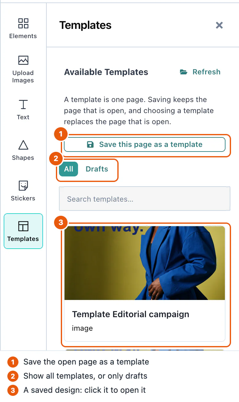
The panel shows a template only when it has scene, a thumbUri, and sceneMode: 'image'. Return the objects that onSaveTemplate received, and they meet these rules.
To open the editor with a design already on the page, pass the template as defaultTemplate. The editor reads it once, when it starts.
<ImageEditor
  defaultTemplate={template}
/>A template keeps the page size it was made with. templateCanvasPolicy decides what happens when that size differs from the current page:
| Value | What happens |
|---|---|
'adopt' | The page takes the size of the template. The design looks exactly as it was made. This is the default. |
'fit' | The page keeps its size. The design is scaled to fit inside it, and centered. |
'place' | The page keeps its size, and the design is placed without scaling. |
Drafts
A draft is a design that the user has not finished. Save draft in the export panel saves it through the same onSaveTemplate, with draft: true in the template. The Templates panel then shows a Drafts filter with the number of drafts.
Saving a draft again updates the same record. The first draft save of a design makes a new template.id, and every later draft save of that design sends the same id, from the button, the keyboard, or automatic saving. Opening a draft from the Templates panel continues that draft under its own id. Opening another template, the defaultTemplate, or a new blank design starts a new record. A finished template save gets a new id every time. Store drafts by template.id, and replace a record that has the same id.
To save drafts while the user works, set ui.drafts.autosave. Default: false.
<ImageEditor
  ui={{ drafts: { autosave: true } }}
  onSaveTemplate={saveTemplate}
  onGetTemplates={getTemplates}
/>Autosave starts after the user presses Save draft once. Then each change starts a 30-second wait, and each further change starts the wait again. So a user who keeps working is saved once, 30 seconds after the last change.
Server-side handling
Store each template as the editor gives it to you, and return the same objects from your list. This Node.js server stores each record as a file:
import { createServer } from 'node:http';
import { mkdir, readdir, readFile, writeFile } from 'node:fs/promises';

const FOLDER = './templates';
await mkdir(FOLDER, { recursive: true });

async function readBody(request) {
  const chunks = [];
  for await (const chunk of request) chunks.push(chunk);
  return JSON.parse(Buffer.concat(chunks).toString('utf8'));
}

createServer(async (request, response) => {
  if (request.url !== '/api/templates') {
    response.writeHead(404).end();
    return;
  }
  if (request.method === 'POST') {
    const payload = await readBody(request);
    const template = payload.template ? { ...payload, ...payload.template } : payload;
    if (payload.template) delete template.template;
    if (!/^[\w-]+$/.test(String(template.id))) {
      response.writeHead(400).end();
      return;
    }
    // Store the record exactly as the editor sent it, including fields you do not use.
    await writeFile(`${FOLDER}/${template.id}.json`, JSON.stringify(template));
    response.writeHead(201).end();
    return;
  }
  const files = await readdir(FOLDER);
  const templates = await Promise.all(
    files.map(async (file) => JSON.parse(await readFile(`${FOLDER}/${file}`, 'utf8'))),
  );
  response.writeHead(200, { 'Content-Type': 'application/json' });
  response.end(JSON.stringify(templates));
}).listen(3001);
A template has these fields:
| Field | Type | Description |
|---|---|---|
id | string | A new UUID for each save. |
scene | string | The design, as JSON text. Store it as it is. |
thumbUri | string | A small PNG picture of the design. It is a data: URL, or the address that onUploadAsset returned. |
sceneMode | string | 'image' for designs of the image editor. |
global | boolean | false. |
schemaVersion | number | The version of the scene format, 1. |
canvasWidth, canvasHeight | number | The page size in pixels, for example 1080 × 1080. |
draft | boolean | true for a draft. Absent for a finished template. |
The Template type also declares voiceoverScript. Only the video editor writes it.
The pictures in a design are stored inside scene, unless you pass onUploadAsset. See Asset storage.
Each save also sends a templatesave DOM event, with detail: { template, saved }. Use it to log saves in code that does not do the saving. See Events.
Item locking
@layermetry/media-editor. It needs version 1.0.0 or later; versions before 1.0.0 do not have the props and fields in this section.A lock stops some kinds of change to one item. For example, a person can change the words of a headline but cannot move the logo. The person who made the design sets the locks. Your application tells the editor who is editing, and the editor obeys the locks for that person.
Lock roles
The role prop says who is editing. You choose it for each person. The editor never decides it.
role | Who it is for | What this person may do |
|---|---|---|
'creator' | The person who made the design. | Ignores every lock. May lock and unlock items, and may set the design's default locks. |
'adopter' | A person who reuses the design. | Obeys every lock. May unlock only when you pass allowUnlock, and only when your onUnlock agrees. |
'viewer' | A person who only looks. | May look at the design, select items and export. Changes nothing. The editor hides the editing tools and the canvas toolbar. Undo and zoom stay. |
When you pass no role, the role is 'adopter'. A value that is not one of the three names is also read as 'adopter'.
This is a change from earlier releases. Before item locking, a missing role changed nothing. Now a missing role means 'adopter'. The editor then obeys the locks in the design, and nobody can lock or unlock. This affects you only when your designs already carry isLocked: true or locks on an item, or defaultLocks on the record. No earlier release of the editor wrote a lock, so a design has one only if your own code or server put it there. A design without locks behaves as before. Pass role="creator" for each person who should ignore locks.
Lock props
Pass the four lock props to the editor. This example opens the editor for an adopter. It lets that person ask to unlock, records each unlock in your audit log, and locks the position of every item that has no lock of its own:
<ImageEditor
  role="adopter"
  allowUnlock
  onUnlock={handleUnlock}
  defaultLocks={{ move: true }}
/>| Prop | Type | Default | What it does |
|---|---|---|---|
role | 'creator' | 'adopter' | 'viewer' | 'adopter' | Who is editing. See Lock roles. |
allowUnlock | boolean | false | Lets an adopter ask to unlock. A creator may always unlock. A viewer never may. |
onUnlock | (event) => answer, or a Promise of an answer | none | Called before every unlock, a creator's too. See Unlocking items. |
defaultLocks | object, for example { move: true } | the design's own default locks | Replaces the design's own default locks for this session. A save never writes it. |
When a prop changes while the editor is open, the editor uses the new value at once.
TypeScript names the types ImageEditorRole, ImageLockScopes, ImageUnlockHandler, ImageUnlockEvent and ImageUnlockAnswer. The package also exports ImageLockScope, ImageUnlockRecord and ImageLockManifest. They come from @layermetry/media-editor, @layermetry/media-editor/embed and @layermetry/media-editor/react.
Lock scopes
Each kind of change that a lock can stop has a name, called a scope. A lock is a list of scopes.
| Scope | Switch in the lock panel | When it is locked, the item cannot… |
|---|---|---|
content | Words and picture | have the words or picture changed. |
style | Look | have the look changed. |
move | Position | be moved. |
resize | Size | be resized. |
rotate | Rotation | be turned. |
crop | Crop and mask | be cropped or masked. |
delete | Deleting | be deleted. |
select | Selecting | be selected. |
duplicate | Copying | be copied. |
arrange | Layer order and groups | be moved to another layer or group. |
add | Adding new items | This scope is for the whole design: no new item can be added. |
add is a lock on the whole design, not on one item. The editor reads it only from the design's default locks. The item lock panel does not show it. The Default locks… panel does.
There are three more scopes: timing, animate and audio. They belong to the video editor. A still design has no timeline, no animation and no sound, so these scopes change nothing in the image editor, and the lock panel does not show them. The image editor keeps them in a design, so a design that the video editor locked keeps its locks after a save here.
Lock fields
The locks are stored in the design, so every save carries them:
| Field | Where it is | What it means |
|---|---|---|
locks | On an item, inside scene. | The locked scopes of this item, for example { "move": true, "delete": true }. Only the value true locks a scope. A scope that is missing is not locked. |
isLocked | On an item, inside scene. | The older field. true means that every scope is locked. It still works. |
unlocks | On an item, inside scene. | One record for each unlock that an adopter made. See Unlocking items. |
defaultLocks | On the record, next to scene. | The design's default locks, for example { "move": true, "add": true }. They lock every item that has no lock of its own. |
The editor decides the locked scopes of one item in this order:
- When
isLockedistrue, every scope is locked. - Otherwise, when the item has a
locksobject, the scopes in it are locked. An empty object,{}, locks nothing, and the default locks do not apply to that item. - Otherwise, the design's default locks apply.
Only the lock menus change these fields. When any other change writes locks, isLocked or unlocks, the editor restores the old value.
Unlocking items
An unlock removes scopes from the lock of one or more items. A creator may always unlock. An adopter may unlock only when you pass allowUnlock. A viewer never may. Every unlock follows these steps:
- The editor checks the role and
allowUnlock. When they do not allow the unlock, it is refused, and youronUnlockis not called. - The editor calls your
onUnlockand waits for its answer. It does this before every unlock, a creator's too. - When you allow the unlock, the editor removes the scopes. For an adopter, it also adds an unlock record to each item that lost a scope. An item that had none of the asked scopes locked stays as it is and gets no record. A creator's unlock adds no record.
- Without
onUnlock, the editor unlocks the items when step 1 allows it, and still adds the adopter's record.
Your onUnlock receives one event:
| Field | Type | What it holds |
|---|---|---|
itemIds | string[] | The items to unlock. |
scopes | string[] | The scopes to unlock. |
role | string | The role of the person who unlocks. |
origin | 'user' or 'host' | 'user' when a person presses Unlock in the editor. |
Your answer decides what happens:
| Your answer | Result |
|---|---|
false | The unlock is refused. Nothing changes. |
{ allowed: false } | The unlock is refused. Nothing changes. |
A rejected Promise, or an error thrown | The unlock is refused. Nothing changes. |
true, nothing, or { allowed: true } | The editor unlocks the items. |
{ ref: 'audit-1' } | The editor unlocks the items and stores 'audit-1' in the unlock record. |
Use ref for the id of the entry in your own audit log. The editor keeps a ref only when it is text that is not empty.
An unlock record looks like this:
{ "scopes": ["move"], "at": "2026-10-05T09:30:00.000Z", "role": "adopter", "ref": "audit-1" }scopes lists the scopes that the unlock removed from this item. at is the time, as a date and time text such as 2026-10-05T09:30:00.000Z. role is the role of the person. ref is present only when your onUnlock gave one.
Saving locks
Each save gives onSaveTemplate two lock fields, next to scene:
| Field | When it is present | What it holds |
|---|---|---|
defaultLocks | Only when the design has default locks. | The design's own default locks. It is never the value of your defaultLocks prop. |
lockManifest | On every save, also for a design without locks. | A summary of the locks for your server, so that your server does not need to read scene. |
A lockManifest looks like this:
{
  "version": 1,
  "defaultLocks": { "move": true },
  "items": {
    "logo-1": { "locks": ["move", "resize", "delete"] },
    "photo-1": { "locks": ["move"] },
    "headline-1": {
      "locks": [],
      "unlocks": [{ "scopes": ["style"], "at": "2026-10-05T09:30:00.000Z", "role": "adopter", "ref": "audit-1" }]
    }
  }
}
items lists only the items that have a locked scope or an unlock record. Each item's locks is the list of scopes that are locked for it, with the design's own default locks applied, never your defaultLocks prop. In this example, photo-1 has no lock of its own, so it shows the default lock move. headline-1 has no locked scope left, but it is listed because of its unlock record. add never appears in an item's list.
When the editor opens a design, it reads defaultLocks back from the record. The locks inside scene are the ones that count.
Store template.defaultLocks next to scene. You should also store template.lockManifest. The default locks are not inside the scene text. A server that keeps only scene, or drops fields it does not know, loses them. The design then opens with no default locks, and every item without a lock of its own can be changed. The server in Server-side handling stores the whole record, so it keeps both fields.
Checking locks on your server
The editor runs in the person's browser. A person who controls the browser can change a record before it reaches your server. The lock is protection against mistakes, not security.
Your server can still find a lock that was removed without permission. Keep the lockManifest of the template that a design came from. When an adopter saves the design, compare the two manifests. Accept a lock that disappeared only when the item carries an unlock record for that scope, and the record's ref is in your own audit log. A creator's save is a new version of the template, and a creator's unlock leaves no record, so do not run this check for a creator.
This Node.js route writes each unlock to an audit log, and returns the id that your onUnlock returns as ref:
import { createServer } from 'node:http';
import { appendFile } from 'node:fs/promises';
import { randomUUID } from 'node:crypto';

async function readBody(request) {
  const chunks = [];
  for await (const chunk of request) chunks.push(chunk);
  return JSON.parse(Buffer.concat(chunks).toString('utf8'));
}

createServer(async (request, response) => {
  if (request.method !== 'POST' || request.url !== '/api/unlocks') {
    response.writeHead(404).end();
    return;
  }
  const event = await readBody(request);
  const id = randomUUID();
  // One line per unlock: the id, the time, and the event from onUnlock.
  await appendFile('./unlock-audit.jsonl', JSON.stringify({ id, at: new Date().toISOString(), event }) + '\n');
  response.writeHead(201, { 'Content-Type': 'application/json' });
  response.end(JSON.stringify({ id }));
}).listen(3002);
Your page reaches it at /api/unlocks, for example through the proxy of your development server. Add your own sign-in check, so that only a person who may unlock gets an id.
This function compares the two manifests. It returns one line for each lock that disappeared without an approved unlock:
export function findUnapprovedUnlocks(sourceManifest, savedManifest, auditIds) {
  const problems = [];
  for (const [id, before] of Object.entries(sourceManifest.items)) {
    const after = savedManifest.items[id];
    if (!after) {
      // The item was deleted, or it lost every lock without an unlock record. See the note below.
      if (before.locks.length > 0) problems.push(`${id}: the item or its locks are gone`);
      continue;
    }
    for (const scope of before.locks) {
      if (after.locks.includes(scope)) continue;
      const approved = (after.unlocks ?? []).some(
        (record) => record.scopes.includes(scope) && auditIds.has(record.ref),
      );
      if (!approved) problems.push(`${id}: '${scope}' was unlocked without an approved ref`);
    }
  }
  return problems;
}
For example, the template's manifest has "headline-1": { "locks": ["style"] }. The saved design has the manifest shown in Saving locks, where headline-1 has "locks": [] and an unlock record with "ref": "audit-1". Your audit log holds audit-1, so findUnapprovedUnlocks(source, saved, new Set(['audit-1'])) returns [], and you accept the save. With an empty audit log, it returns ["headline-1: 'style' was unlocked without an approved ref"], and you refuse the save. auditIds.has(record.ref) is false for a record without ref, so such a record never approves an unlock.
An item that is missing from the saved manifest was deleted, or lost every lock without an unlock record. The manifest alone cannot tell these two apart, so the function reports both. When delete was not locked on that item, read scene to see whether the item is still there before you refuse the save.
Lock controls
A locked item shows a small lock badge at its top-right corner. The badge has the same size at every zoom, and every role sees it. It never appears in an exported picture, a template preview or a page thumbnail. An item whose select scope is locked cannot be selected by an adopter or a viewer.
A creator finds Lock… on the lock button of the canvas toolbar when items are selected, and Default locks… when nothing is selected. An adopter finds Unlock there when you pass allowUnlock and a locked item is selected. On a phone, the same entries are on the selection bar. The right-click menu has no lock entries. A person who may not use an entry does not see it. The lock panel has one switch per scope, and the buttons Lock everything and Unlock everything. Lock everything leaves select unlocked, so that an adopter can still select the item and ask to unlock it. Turn on the Selecting switch to lock select too.
The image editor has no editor API. The menu entries above are its only way to lock and unlock.
When the editor refuses a change, it shows a short notice with the title "Locked":
| What happened | The notice says |
|---|---|
| An adopter tried a locked change on one item. | "This item is locked: it cannot be moved." |
| An adopter tried a locked change on several items. | "2 items are locked: they cannot be moved or be resized." |
| An adopter copied several items, and one of them is locked against copying. | "1 locked item was left out: it cannot be copied." |
| A viewer tried any change. | "You can look at this design, but you cannot change it." |
| The design does not allow new items. | "New items cannot be added to this design." |
| An adopter tried to open another template over a design that does not allow new items. | "This design does not allow new items, so another template cannot be opened over it." |
| An adopter tried to open another template over a design with items locked against deleting. | "This design has items that cannot be deleted, so another template cannot replace it." |
Your onUnlock refused an unlock. | "The unlock was not allowed." |
Asset storage
The pictures in a design can live in your own storage. You pass onUploadAsset, the editor gives it each picture as a File, and your code returns the permanent address. The design then refers to that address.
Without onUploadAsset, the pictures are saved inside the design as data: URLs. This works, but it makes each saved template large.
Uploads
onUploadAsset(file, ctx) returns a promise of { url }. The editor calls it when the user saves a template or a draft: once for each picture in the design, and once for the small preview picture of the template.
<ImageEditor
  onSaveTemplate={async ({ template }) => console.log(`Saved template ${template.id}`)}
  onUploadAsset={uploadAsset}
  assetMetadata={{ workspace: 'marketing' }}
/>Default: none. A rejected promise stops the save, and the user sees "We couldn't store this design's media, so nothing was saved."
ctx describes the file:
| Field | Description |
|---|---|
type | 'image' for a picture, 'thumbnail' for the preview picture of a template. |
itemId | The id of the picture in the design. |
mimeType | The type of the file, for example 'image/png'. |
templateId | The id of the template being saved. |
sceneMode | 'image'. |
suggestedPath | A path you can use as the storage key, for example templates/1790622792246_363bf8c1-…. |
source | 'template' when the user saves, 'generated' for a picture made or changed with AI. |
The context type is the same in both editors, so one onUploadAsset function fits both. It also declares source: 'recorded', take, and punchIn, which only the video editor's voiceover recorder sends. The image editor never sends them.
assetMetadata adds your own text fields to every ctx, for example a workspace or a customer id. The editor's own fields win if a name is the same.
<ImageEditor
  assetMetadata={{ workspace: 'marketing' }}
/>A picture that your storage returns must allow cross-origin requests, because the editor draws it on a canvas.
Loading stored pictures
When a template is loaded, an address that starts with http is used as it is. For other stored values, the editor asks resolveAssetUrl, then tries assetBaseUrl:
| Prop | Type | Description |
|---|---|---|
resolveAssetUrl | (stored, { type }) => Promise<string> | Turns a stored value, such as a storage key, into an address the browser can load. Use it for signed addresses that expire. |
assetBaseUrl | string | The address that a stored path is added to, for example https://cdn.example.com. |
<ImageEditor
  resolveAssetUrl={async (stored) => {
    const response = await fetch(`/api/signed-url?key=${encodeURIComponent(stored)}`);
    return (await response.json()).url;
  }}
/>When onUploadAsset returns a storage key instead of a web address, the picture keeps your key in the design. A later save keeps the key, sends nothing to onUploadAsset again, and writes no picture bytes into the design. This is true for a picture from Edit with AI, from Add to canvas on a generated picture, from Generate background, and for a picture in a design that was saved and opened again. When the design opens again, the editor loads the picture from the key through resolveAssetUrl, or assetBaseUrl.
Keeping pictures inside the design
inlineTemplateMedia saves every picture inside the design, even when you pass onUploadAsset. Default: false.
<ImageEditor
  inlineTemplateMedia
/>Generated media
AI services may return temporary picture URLs. Generated pictures pass through onUploadAsset with source: 'generated'; the design uses the reference your host returns.
For these uploads, ctx also has:
| Field | Description |
|---|---|
capability | The AI feature: 'image' or 'imageEdit'. |
producedBy | { capability, providerId }: the feature and the model that made the picture. |
suggestedPath | For example generated/imageEdit-1790622792246.png. |
If onUploadAsset is missing or fails, the picture keeps the address of the AI service until the next save. Then the editor stores it like any other picture.
Temporary assets
A picture that the user uploads stays inside the browser as a data: URL until the design is saved. Nothing is sent to your server when the user adds a picture.
When the user saves, each temporary picture, and each picture from an AI service, goes to onUploadAsset. Without onUploadAsset, it is saved inside the design. Pictures that already have an http address from your storage are not uploaded again.
The exported file that onExport receives is separate from these assets. See Export.
Stock media
The editor can search Pexels and Unsplash for photos, and GIPHY for stickers. You connect each service with your own account. Each one is off until you configure it.
This example connects all three through your own server, so that your keys stay on the server:
<ImageEditor
  stockMediaApis={{
    pexels: { endpointUrl: 'https://api.example.com/pexels' },
    unsplash: { endpointUrl: 'https://api.example.com/unsplash', showAttribution: true },
  }}
  stickers={{
    sources: [builtInStickers(), giphyStickers({ endpointUrl: 'https://api.example.com/giphy' })],
  }}
/>Each service takes exactly one of three connections:
| Connection | What happens | Use it for |
|---|---|---|
apiKey | The browser calls the service with your key. Anyone who opens the page can read the key. | Local tests |
endpointUrl | The browser calls your server, and your server calls the service with your key. | Production |
searchFn (Pexels, Unsplash) or requestFn (GIPHY) | The editor calls your function, and your function returns the response. | Your own client code |
A searchFn receives search parameters such as query, page, and perPage. Return { results, total, total_pages }, using the exported StockPhoto type:
| Fields | Requirement |
|---|---|
id, url | Required for every result. |
thumbnailUrl, width, height, alt, attribution, downloadTrackingUrl | Optional. |
Unmodified Pexels and Unsplash responses are also accepted. The editor validates each page: it skips an item missing id or url and logs the omission. A response without a result list appears as a service error.
A setting that names none, or more than one, of apiKey, endpointUrl, and searchFn turns off only that service. Its panel says, for example, "Unsplash photos are not available.", and the console says which setting is wrong.
Pexels
stockMediaApis.pexels connects Pexels. Default: none, and the Pexels tab does not appear.
<ImageEditor
  stockMediaApis={{ pexels: { endpointUrl: 'https://api.example.com/pexels' } }}
/>| Option | Default | Description |
|---|---|---|
showAttribution | true | false hides the photographer's name on the Pexels photo tiles. |
defaultQueries | ['popular'] | Search words shown as buttons under the search field. |
headers | none | Extra headers for requests to endpointUrl, for example your own session token. |
Unsplash
stockMediaApis.unsplash connects Unsplash. Unsplash requires that the photographer's name is shown, so showAttribution: true is required. Default: none, and the Unsplash tab does not appear.
<ImageEditor
  stockMediaApis={{ unsplash: { endpointUrl: 'https://api.example.com/unsplash', showAttribution: true } }}
/>| Option | Default | Description |
|---|---|---|
showAttribution | required, true | Shows the photographer's name on each photo. |
trackDownloads | true | Tells Unsplash each time a photo is used, as the Unsplash guidelines ask. |
defaultQueries | ['nature'] | Search words shown as buttons under the search field. |
headers | none | Extra headers for requests to endpointUrl. |
Photo credits
A stock photo keeps its photographer's credit after the user places it. The placed item carries attribution, which is saved with templates and drafts.
When the design holds a stock photo with a credit, the Export panel shows two switches:
| Switch | What it does |
|---|---|
| Show photo credits on the canvas | Draws the credits, such as "Photo by Ana on Unsplash", in a small dark box in the bottom-left corner of the canvas. |
| Include photo credits in the export | Writes the same box into the exported file. |
The user's choice is saved with the design, and it can be undone. showAttributionOverlay and includeAttributionInExport set the starting value of each switch. Both are false by default.
To show credits your own way, hide a switch. A hidden switch always follows your prop:
<ImageEditor
  ui={{ exportOptions: { hidden: ['photoCreditsOverlay', 'photoCreditsInExport'] } }}
/>stockMediaApis.pexels.showAttribution: false hides the photographer's name on the Pexels photo tiles. Unsplash tiles always show the name, because Unsplash requires it.
GIPHY
GIPHY is a source of stickers. You connect it in the stickers prop with giphyStickers, not in stockMediaApis. Default: the built-in stickers only.
<ImageEditor
  stickers={{ sources: [builtInStickers(), giphyStickers({ endpointUrl: 'https://api.example.com/giphy' })] }}
/>| Option | Default | Description |
|---|---|---|
apiKey, endpointUrl, or requestFn | none, one is required | The connection. endpointUrl can be a path on your own site, such as /api/giphy. |
id | 'giphy' | The id of the source. |
label | 'GIPHY' | The name of the source in the Stickers panel. |
See Stickers and GIFs for what the user sees.
Where providers appear
| Service | Where the user finds it |
|---|---|
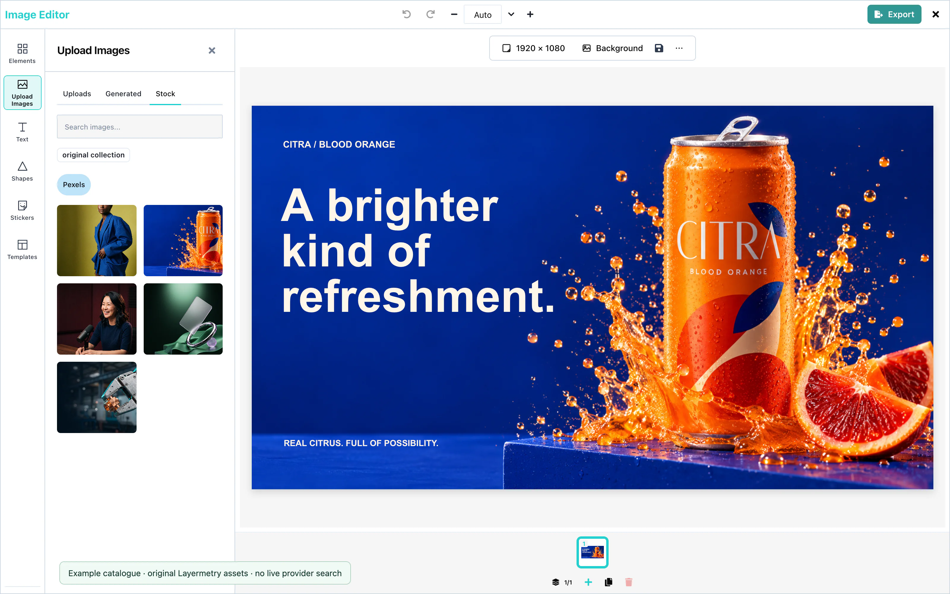
| Pexels, Unsplash | The Upload Images panel, on the Stock Images tab, with one tab for each service. |
| Unsplash | The Background panel, on the Image tab. The chosen photo fills the page. |
| GIPHY | The Stickers panel, as a source next to the built-in stickers. |
 View full size
A search shows 15 photos at a time, and Load More shows the next 15. The editor asks for photos in the shape of the page: landscape, portrait, or square.
AI providers
The ai prop switches on the AI features of the image editor and says where their requests go. Without ai, the editor shows no AI control and sends no AI request.
The image editor has five AI features: text generation (text), text rewriting (textRewrite), image generation (image), AI image editing (imageEdit), and shape generation (svgPath). See UI customization for where each appears.
ai takes exactly one of three connections: endpointUrl, requestFn, or hosted. With none, or with more than one, AI stays off and the console says why. Hosted AI is coming soon and available only with an enterprise licence from Layermetry.
Hosted service
endpointUrl or requestFn. Hosted AI is coming soon. Available only with an enterprise licence from Layermetry.Use your own endpointUrl or requestFn for generation. hosted: true sends AI requests to Layermetry. Hosted AI is coming soon. Available only with an enterprise licence from Layermetry.
<ImageEditor
  ai={{ hosted: true }}
/>With an enterprise licence from Layermetry, hosted: true sends POST https://api.layermetry.com/kloudleadsai/ai/proxy with your license key in the x-license-key header. Hosted AI is coming soon. Use your own endpointUrl or requestFn for generation and your own mediaApiUrl for background removal; eligible hosted setups use Layermetry’s background-removal service when no media address is set.
When the account that pays for AI has no credits left, a request is refused with ai-credits-exhausted. When the plan does not include a kind of AI work, it is refused with meter-off. Both can carry a top-up address for your own interface. See Top-up address.
Proxy URL
endpointUrl sends AI requests to your own server. Your server calls the AI provider with your provider key, so the key never reaches the browser.
<ImageEditor
  ai={{ endpointUrl: 'https://api.example.com/ai' }}
/>The editor sends POST with a JSON body, and does not send your license key. See Custom AI endpoint for the request and the response your server returns.
Request function
requestFn passes the initial generation request and an AbortSignal to your function. Return the response, or a job handle whose status URL the SDK polls. Use your function to add headers, such as a sign-in token, or to call your own SDK.
<ImageEditor
  ai={{ requestFn: requestAI, limits: { maxPerSession: 20 }, image: { maxPerSession: 2 } }}
/>The request and the response are the same as for endpointUrl. Pass signal to fetch: the editor aborts the request when the user closes the box.
When your function throws, the user sees "Generation failed" and can try again.
Session limits
limits.maxPerSession sets how many AI requests one editor may send while the page is open, for all features together. Default: no limit.
<ImageEditor
  ai={{ endpointUrl: 'https://api.example.com/ai', limits: { maxPerSession: 20 } }}
/>A feature can have its own limit, in the same way: image: { maxPerSession: 2 }. The box shows how many requests are left. When none are left, it says "Generation limit reached", and no request is sent. Every request that the editor sends counts, also one that fails, because a failed request can still cost money.
The editor counts in the browser, and a new page starts again at zero. A user can change the count in their own browser, so this limit protects against mistakes, not against abuse. Enforce your real limits on your server.
Per-feature options
Each feature takes false, true, or an object. false switches the feature off. true, or leaving the feature out, switches it on.
<ImageEditor
  ai={{
    endpointUrl: 'https://api.example.com/ai',
    textRewrite: false,
    image: { maxPerSession: 5 },
    svgPath: { transport: { endpointUrl: 'https://shapes.example.com/ai' } },
  }}
/>| Key | Default | Description |
|---|---|---|
text | on | Writes new text. |
textRewrite | on | Rewrites the selected text. |
image | on | Creates a picture. |
imageEdit | on | Changes the selected picture. |
svgPath | on | Creates a shape. |
limits | none | { maxPerSession } for all features together. |
An object for one feature can have:
| Key | Description |
|---|---|
maxPerSession | The limit for this feature. See Session limits. |
transport | A connection for this feature only: { hosted: true }, { endpointUrl }, or { requestFn }. Other features keep the main connection. Hosted AI is coming soon and available only with an enterprise licence from Layermetry. |
A key that the editor does not know turns AI off, and the console names the key: "ai.<key> is not a setting this version knows."
Saving generated results
ai.generatedStore.onSave receives text results when they are generated. File results use saveFiles: 'all' by default; when you provide onUploadAsset, the file uploads before its record is pushed. Set saveFiles: 'used' to wait until a file is placed. The list matches records by userId and brandId; other scope fields are carried but not compared. See Save generated results for the details, flow diagram, defaults and host checklist.
Generation results
The first returned suggestion is selected automatically. For Rewrite with AI and Edit with AI, it appears on the existing item. Click a different card to compare it. Leaving the box keeps the selected card as one editing action and one Undo step. This includes ✕, Escape, Enter from the results, changing selection or opening another panel. Choose Original before leaving to make no change.
The text card says Original (your text now). A returned wording identical to it says Same as your text. Picture edits label the source Original. If the target was deleted, the editor says That item was deleted, so the change was not kept.
Generate more appends suggestions using the previous request. Try again replaces the current choices. The count excludes Original and states the number actually returned. The SDK sends the selected field values to your host through the configured schema, including any sendAs names. If your service returns fewer suggestions than requested, handling that count belongs to your service; the editor does not create extra answers.
For a new result shown in the box, the add action depends on its destination:
| Result | Add action |
|---|---|
| Text, picture, sticker, shape | Add to canvas |
| A result made from the Background panel | Set as background |
In the Text panel, Generated uses the same list as Elements. With no text selected, selecting a text result adds it. With editable text selected, choose Replace selected to keep its font family, font size and position, or Add as new. Replacement is one Undo step. Rewriting clears per-letter style ranges; the font family, font size and position remain. Locked text has no Replace selected action.
The toolbar action Rewrite with AI opens the Text panel form in rewrite mode. With selected text, the form can change the words or put them in a template; + New starts a separate text item.
Custom AI endpoint
With ai={{ endpointUrl }} or ai={{ requestFn }}, your code handles the image editor's AI requests. The following contract describes the request that the editor sends, the response it reads, and the errors it understands. See AI providers for the connection itself.
Pass the endpoint URL as ai.endpointUrl. Route /ai to the Node.js server below, or deploy it on your origin:
<ImageEditor
  ai={{ endpointUrl: '/ai' }}
/>Request format
The editor sends POST to your endpointUrl, with Content-Type: application/json. It does not send your license key. With requestFn, your function receives the same object.
{
  "type": "image",
  "prompt": "A paper kite over a green hill",
  "input": { "operation": "image", "prompt": "A paper kite over a green hill" },
  "options": { "action": "create", "provider": "…", "count": 1 }
}
Every request of the image editor carries options.provider, the name of a vendor. The editor names that vendor for the reference backend, which reads it. Your server can ignore provider and choose its own vendor and model. The examples on this page show its value as "…".
| Field | Description |
|---|---|
type | The kind of result: "text", "image", or "SVGPath". |
prompt | The full instruction for the model, ready to send. |
input | What the user asked for. input.operation names the feature. |
options | Hints for your server, such as count and provider. You can ignore them. |
input.operation is one of five values in the image editor:
input.operation | type | Other fields of input | prompt |
|---|---|---|---|
text | text | prompt | What the user typed. |
textRewrite | text | text (the current words), instruction | Rewrite the text below. Instruction: … followed by the text. |
image | image | prompt | What the user typed. |
imageEdit | image | prompt, source.dataUrl (the picture itself, written as text), sourceSize (its width and height in pixels) | What the user typed. |
svgPath | SVGPath | prompt | What the user typed. |
Response format
Answer with status 200 and { items: [...] }. Each item’s fields depend on input.operation:
input.operation | Answer | Results shown |
|---|---|---|
text, textRewrite | { "items": [{ "text": "…" }] } | Up to 3 |
image, imageEdit | { "items": [{ "url": "https://cdn.example.com/result.png" }] } | Up to 4 for image, up to 3 for imageEdit |
svgPath | { "items": [{ "pathData": "M10 10 L90 10 L50 90 Z" }] } | Up to 6 |
Return each suggestion as an object with a nonempty text field inside items. This shape works with both built-in providers and custom models.
Each url in items is an https address that allows cross-origin requests, or a data: URL. The editor downloads the picture.
Each pathData in items is the d attribute of an SVG path, in a box of about 100 by 100 units. The SDK refuses path data that does not start with M or m. The editor leaves out an outline that the browser cannot draw.
A complete endpoint
This endpoint handles every image editor request. It runs on port 5178. Its small functions return fixed results. Replace them with calls to your AI vendor. Serve the endpoint from the same site as the editor, or add CORS headers.
import http from 'node:http';

// Replace these functions with calls to your AI vendor. Keep the vendor key on this server.
async function writeSuggestions(prompt, count) {
  return Array.from({ length: count }, (_, i) => `${prompt} (${i + 1})`);
}
async function makePicture(prompt, sourceDataUrl) {
  return 'https://cdn.example.com/pictures/sample.png';
}
async function makeShapeOutline(prompt) {
  return 'M 50 5 L 95 95 L 5 95 Z';
}

// Turns one request of the editor into the answer the editor reads.
async function answer({ prompt, input, options = {} }) {
  switch (input.operation) {
    case 'text':
    case 'textRewrite': {
      const texts = await writeSuggestions(prompt, options.count ?? 3);
      return { items: texts.map((text) => ({ text })) };
    }
    case 'image':
    case 'imageEdit':
      return { items: [{ url: await makePicture(prompt, input.source?.dataUrl) }] };
    case 'svgPath':
      return { items: [{ pathData: await makeShapeOutline(prompt) }] };
    default:
      return null;
  }
}

function send(response, status, body) {
  response.writeHead(status, { 'Content-Type': 'application/json' });
  response.end(JSON.stringify(body));
}

http
  .createServer(async (request, response) => {
    if (request.method !== 'POST' || request.url !== '/ai') return send(response, 404, {});
    // Check the user's session here, before you spend money on a request.
    let raw = '';
    for await (const chunk of request) raw += chunk;
    const aiRequest = JSON.parse(raw);
    try {
      const result = await answer(aiRequest);
      if (!result) {
        const message = `This server does not handle ${aiRequest.input.operation}.`;
        return send(response, 400, { error: { code: 'invalid-input', message } });
      }
      send(response, 200, result);
    } catch (error) {
      send(response, 502, { error: { code: 'transport-failed', message: error.message } });
    }
  })
  .listen(5178);
Run it with Node.js 18 or later: node server.mjs.
For imageEdit, the editor reads the picture itself and sends it as input.source.dataUrl, a data: text such as data:image/png;base64,… (a JPEG picture keeps its own type), so your server does not have to fetch an address. options.image holds the same text, and options.size is the size that is nearest to the shape of the picture: 1024x1024, 1536x1024, or 1024x1536. Send the picture and prompt to your vendor's picture editing service, and respond with { items: [{ url }] }, as for image.
Error codes
To refuse a request, respond with a status of 400 or higher and this JSON body:
{ "error": { "code": "limit-reached", "message": "You have made 20 pictures today. Try again tomorrow." } }The editor shows a title for the code, and your message under it. A code that is not in the table below, or an respond without a JSON body, shows "Generation failed" and "AI request failed (HTTP 502)." with the status. For ai-quota-exceeded, ai-credits-exhausted, and meter-off, the editor shows fixed words instead of your message, and writes your message to the browser console. See AI errors.
| Code | Title the user sees |
|---|---|
invalid-input | That cannot be sent |
ai-quota-exceeded | AI requests are paused for now |
ai-credits-exhausted | AI is temporarily unavailable |
meter-off | This AI feature is not available here |
limit-reached | Generation limit reached |
unsupported-model, unsupported-provider | That model is not available |
no-provider | No model is set up for this |
sign-in-required | Sign in again to keep generating |
identity-mismatch | Switch to the account this belongs to |
identity-unverifiable | Your sign-in could not be checked — try again shortly |
store-unavailable | Nothing was generated, and nothing was charged |
transport-failed, invalid-response | Generation failed |
Send ai-credits-exhausted with HTTP 402 when the account that pays for AI has no credits left, and meter-off with HTTP 403 when the plan does not include this kind of AI work. With either, you can add topUpUrl to error: the https address where the account buys more credits. The editor passes it to your code as error.topUpUrl and shows no link itself. See Top-up address.
See Error codes for every code, including the ones that the editor and the Layermetry service produce.
An respond with status 200 that is not JSON shows "The answer could not be read as JSON." A request that cannot reach your server shows "Generation failed". The user can press Try again.
Events
The editor tells your code about four moments: a design is saved, a design is exported, the editor closes, and something goes wrong. You receive them as callback props. The custom element also sends them as DOM events.
Pass callbacks directly to ImageEditor:
<ImageEditor
  onSaveTemplate={saveTemplate}
  onLicenseState={(report) => console.log(report.state.status, report.reference)}
/>| Callback | DOM event | When |
|---|---|---|
onSaveTemplate | templatesave | The user saves a template or a draft. |
onExport | export | The user presses Save & Exit or Share in the export panel. |
onClose | close | The user closes the editor, and after Save & Exit. |
onLicenseState | none | The state of the license changes. |
onUploadAsset | none | The editor needs to store a picture. See Asset storage. |
The DOM events bubble, and they cross shadow DOM boundaries, so a listener on document also receives them.
Save
onSaveTemplate({ ...metadata, template }) saves the design. The editor waits for the promise that it returns, so a DOM event cannot replace it. See Saving and loading.
After each save, the element also sends templatesave, with detail: { template, saved }. saved is false when the save failed or took more than 30 seconds. template is null when the editor could not prepare the design.
Export
onExport(file, extras) receives the finished design as a File. See Export for the formats.
<ImageEditor
  onExport={(file) => console.log(`${file.name}: ${file.size} bytes, ${file.type}`)}
/>extras is present when the user presses Share, or when the editor was opened with a defaultTemplate. extras.email is { to, name }: the address and the name that the user typed. extras.templateID is the id of the defaultTemplate. Read each field with a check, such as extras?.email?.to.
callback is an older name for onExport. The editor calls both, so use only one of them.
The custom element sends one export event for each export. event.detail is the File. The extras object is not in the event: read it from the second argument of onExport.
The Download button in the export panel saves the file on the user's computer and calls no callback.
Close
onClose() is required. The editor calls it when the user presses the close button in the top bar, and after Save & Exit. Remove or hide the editor when it runs.
<ImageEditor
  onClose={() => setIsOpen(false)}
/>The custom element also sends a close event. Do not read its detail: after Save & Exit it is empty, and after the close button it is the editor's own click event.
The close button does not ask the user to save first. Use the draft controls and Saving and loading to preserve unfinished designs.
Errors
The editor has no single error callback. Each kind of problem reaches you in its own way:
| Problem | How you learn about it |
|---|---|
| The license is refused or cannot be confirmed | onLicenseState, with state.status 'blocked' and a reason. See License validation. |
| A save fails | Your own onSaveTemplate promise rejects, and templatesave has saved: false. |
| A picture cannot be stored | Your own onUploadAsset promise rejects. The save stops. |
| An AI request fails | The editor shows the error in the AI box. Your proxy or requestFn sees the failure first. See Custom AI endpoint. |
The ai setting is wrong | The console shows "[MediaEditor] ai is not usable, so AI stays off:" and the reason. |
<ImageEditor
  onLicenseState={(report) => {
    if (report.state.status === 'blocked') {
      console.error(`License blocked (${report.state.reason}): ${report.reference}`);
    }
  }}
/>report.reference is a short line for your support team. It never contains the license key. See Error codes for every reason.
Handling the export
The editor calls onExport with the finished design as a File, when the user presses Save & Exit in the export panel. The file has the format that the user selected there.
<ImageEditor
  onExport={handleExport}
/>The Download button in the export panel saves the file on the user's computer instead, and does not call onExport. See Export.
An App Router handler can receive this multipart upload. This Node.js example logs the received bytes; store them in your own storage service. Accept the selected output format without changing its filename or MIME type.
export const runtime = 'nodejs';

export async function POST(request: Request) {
  const form = await request.formData();
  const design = form.get('design');
  if (!(design instanceof File)) {
    return Response.json({ error: 'The request has no design file' }, { status: 400 });
  }
  const bytes = Buffer.from(await design.arrayBuffer());
  // Store the bytes in your own storage here.
  console.log(`Received ${design.name}: ${bytes.length} bytes, ${design.type}`);
  return Response.json({ name: design.name }, { status: 201 });
}
The uploadDesign function in Launch from a button posts the file to this route. The file has the format that the user selected in the export panel. See Export.
Content
Text
Text boxes hold the words of a design. The user picks the font, size, color, and alignment, styles single words, and adds outline, shadow, and gradient. Ready-made text templates and AI help write the words.
Text works with no setup. Three props add more:
<ImageEditor
  googleFonts={{ endpointUrl: '/api/fonts' }}
  templateMetadata={{
    metadata: {},
    textStyles: {
      headline: {
        textStyleName: 'Brand headline',
        fontFamily: 'Montserrat',
        fontSize: 64,
        fontWeight: 700,
        lineHeight: 1.1,
        fontStyle: 'normal',
        textDecoration: 'none',
      },
    },
  }}
  ai={{ endpointUrl: 'https://api.example.com/ai' }}
/>| Option | Prop | Page |
|---|---|---|
| The whole Google Fonts catalog | googleFonts | Fonts |
| Your brand's text styles | templateMetadata.textStyles | Brand text styles |
| AI text generation and rewriting | ai | AI providers |
| Host text templates | textTemplates | Text templates |
Text panel
The Text panel is ordered as follows: a selected-text strip when one item is selected; the AI control (Generate with AI, or Rewrite with AI and + New with text selected); Brand styles when a brand is active; Add text (Heading, Subheading and Body text); Styles (four previews and See all); and Generated. Sections fold. The Text styles toolbar control opens this panel at Brand styles.
Text boxes
Press Add text in the toolbar above the page, or open the Text panel and press Add Text. The Text panel offers Heading (48 px), Subheading (28 px) and Body text (18 px). When a brand is active, the tiles use its Title, Subtitle and Body styles.
Double-click a text box to type in it. Enter ends the editing, and Shift+Enter starts a new line. Esc, or a click outside the box, also ends the editing.
When a text box is selected, the toolbar above the page shows:
| Group | Controls |
|---|---|
| Text | Rewrite with AI, font, align left, center, and right |
| Format | Bold, italic, underline, text color |
| Style | Font size, from 1 to 999, and Text styles |
| Controls | Bring to front, send to back, delete, transparency |
Fonts
Select a text box and press the font button in the toolbar. The Font panel lists font families by category, with a search field. Open a family to choose a weight or italic.
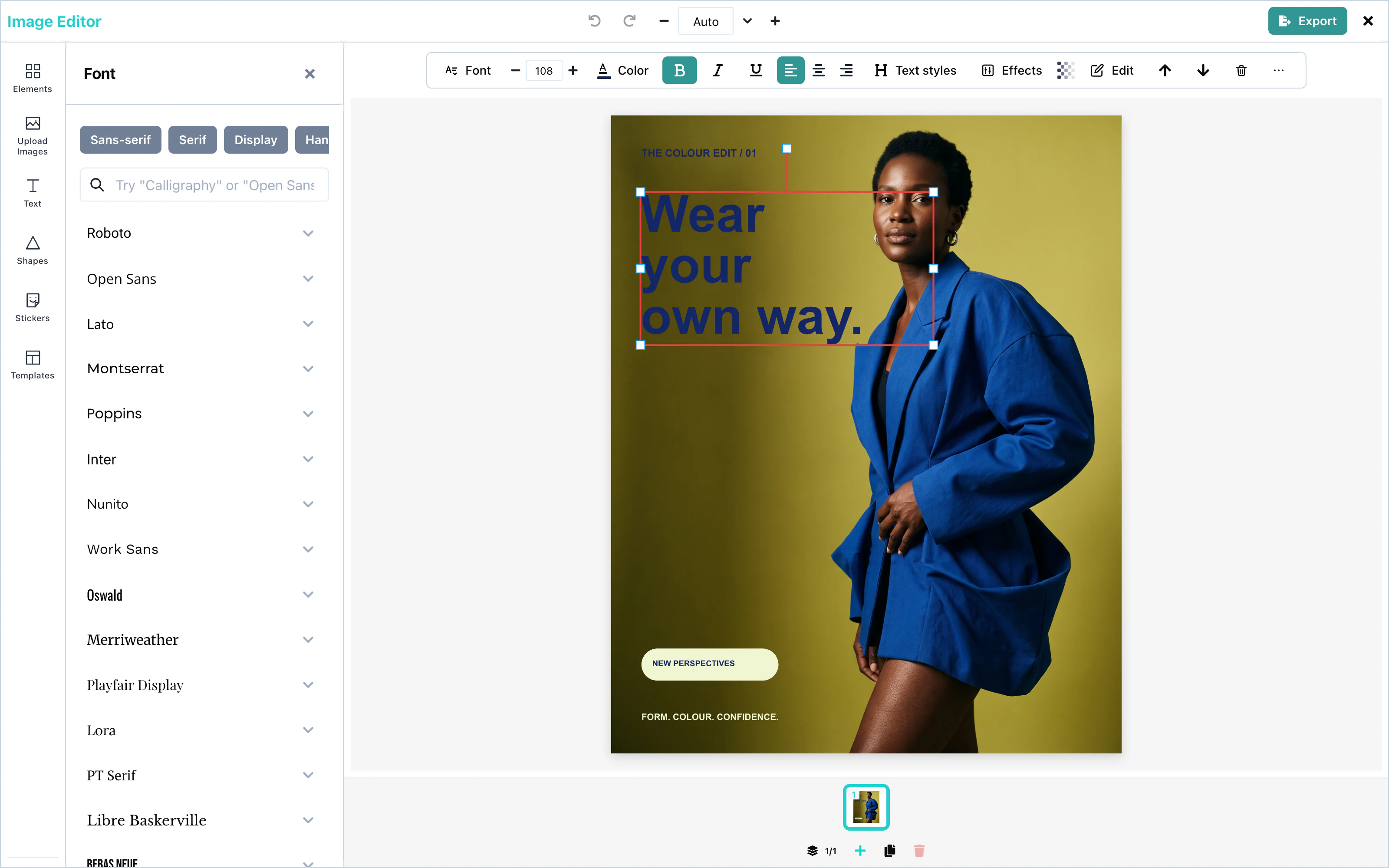 View full size
Without the whole catalog, the panel lists 25 popular families: Roboto, Open Sans, Lato, Montserrat, Poppins, Inter, Nunito, Work Sans, Oswald, Merriweather, Playfair Display, Lora, PT Serif, Libre Baskerville, Bebas Neue, Anton, Righteous, Alfa Slab One, Pacifico, Satisfy, Dancing Script, Caveat, Roboto Mono, Source Code Pro, and JetBrains Mono.
The panel can also list the whole Google Fonts catalog, about 1,500 families, which the user can search. You choose where that list comes from with googleFonts. It takes exactly one of three ways, and none of them puts a Google key in the page:
| Setting | Where the list comes from |
|---|---|
googleFonts={{ hosted: true }} | The Layermetry server, which uses its own Google key. The request carries your licenseKey, and goes to mediaApiUrl when you set one. |
googleFonts={{ endpointUrl: '/api/fonts' }} | Your own server, which holds your Google key. The editor sends GET with no headers. The address can be relative. |
googleFonts={{ requestFn }} | Your own function. The editor makes no request. |
Without googleFonts, the panel uses its built-in families. If you provide both licenseKey and mediaApiUrl, it requests the font list from your media server and falls back to built-in families if that request fails. A setting that names two ways, or none, prints one console line and uses the built-in families.
Your server or your function answers with the same JSON as the Google Fonts Developer API: an items list in which each entry has family, variants, and category. Other fields are ignored. Your function receives an AbortSignal, which fires when the panel closes before the answer arrives:
<ImageEditor
  googleFonts={{ requestFn: loadFonts }}
/>The editor keeps a good answer for as long as the page is open, so opening the panel again makes no second request. The browser downloads each chosen font from Google Fonts, which needs no key.
googleFontsApiKey is deprecated. It still works, but it sends your Google key in a request from the browser, where anyone who opens the page can copy it. When you pass both, googleFonts wins and the key is not sent. On a page that is not on localhost, the editor prints one console warning about the key. If you keep the key, restrict it by HTTP referrer in Google Cloud Console.
Text style controls
The Text styles control in the canvas toolbar opens the Text panel at Brand styles. There is no separate Text Styles panel. When text is selected, the Styles section also offers size presets (H1 32 px, H2 28 px, H3 24 px, H4 20 px, H5 18 px, Normal 16 px) and case controls (ABC, abc, Abc). See Text for the current panel flow.
Brand text styles
templateMetadata.textStyles appears in Brand styles in the Text panel when a brand is active. A click applies the style to the selected text, or adds text in that style when nothing is selected.
<ImageEditor
  templateMetadata={{
    metadata: {},
    textStyles: {
      headline: {
        textStyleName: 'Brand headline',
        fontFamily: 'Montserrat',
        fontSize: 64,
        fontWeight: 700,
        lineHeight: 1.1,
        fontStyle: 'normal',
        textDecoration: 'none',
      },
    },
  }}
/>| Field | Type | Description |
|---|---|---|
textStyleName | string | The name in the panel. |
fontFamily | string | A font family. Your page must load a font that is not in Google Fonts. |
fontSize | number | The size in pixels. |
fontWeight | number | For example 400 or 700. |
lineHeight | number | The line height, as a multiple of the size. |
fontStyle | string | 'normal' or 'italic'. |
textDecoration | string | 'none' or 'underline'. |
metadata is required in templateMetadata. It adds your own fields to saved templates. See Saving and loading.
Letter case
With text selected, the Text panel’s Styles section includes Size presets and Case controls: ABC for uppercase, abc for lowercase, and Abc for capitalizing each word.
Rich text
A single word or letter can have its own style. Double-click a text box, select part of the text, and press Bold, Italic, Underline, or the text color, or change the font size.
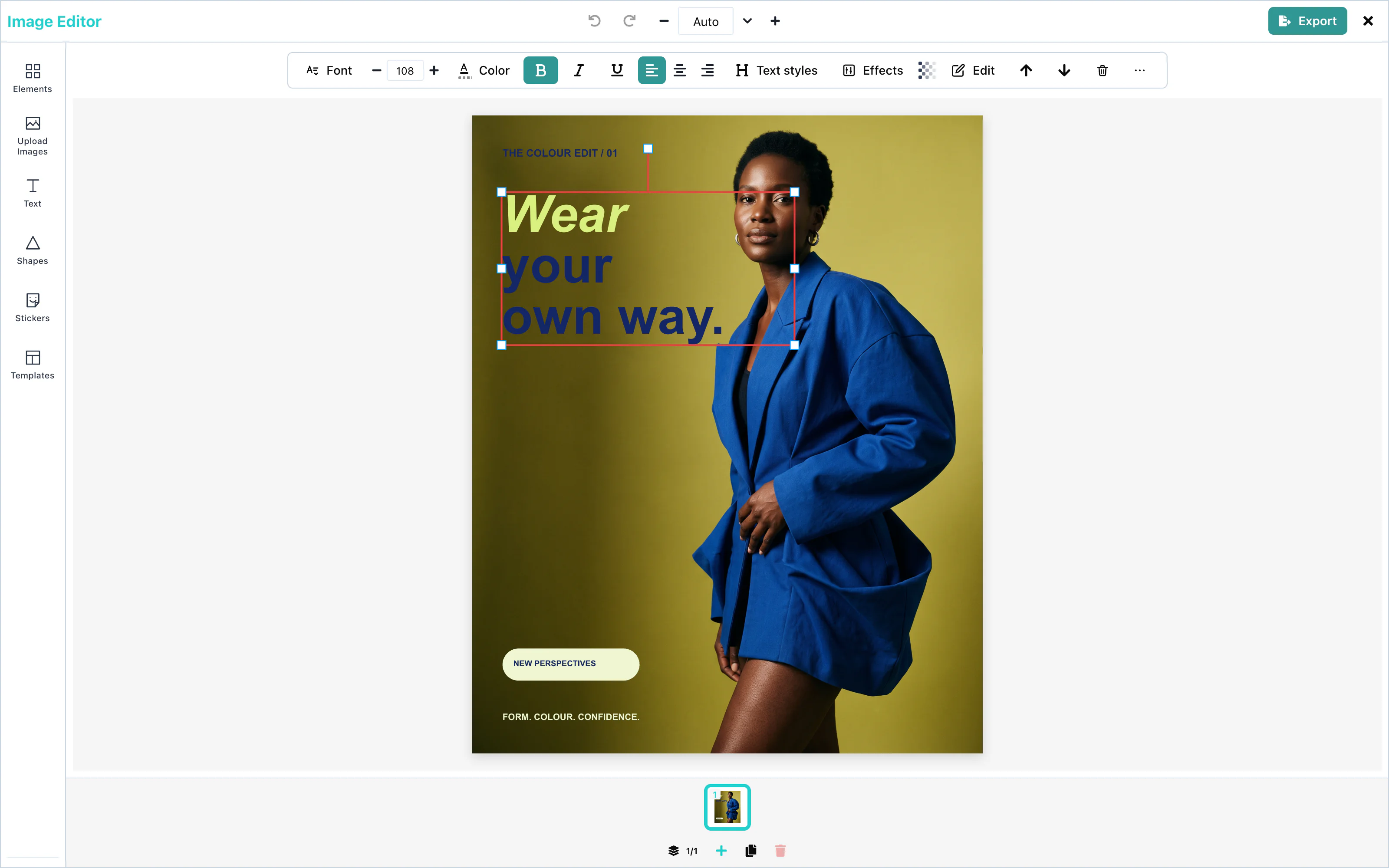 View full size
When part of the text is selected, the tooltips of these buttons end in "selected text". The font, the alignment, and the text styles always apply to the whole text box. A new font size applies to whole lines, so that each line has one size.
When the whole selection already has a style, the button removes it. Otherwise, it adds the style to all of the selection.
Outline and shadow
Select a text box and open the Effects panel. Outline draws a line around the letters. Shadow / Glow draws a soft color behind them.
| Control | Range | When switched on |
|---|---|---|
| Outline color | any color | black |
| Outline width | 0 to 10 | 3 |
| Shadow color | any color | none |
| Shadow Blur | 0 to 40 | 0 |
| Shadow Offset X, Shadow Offset Y | -40 to 40 | 0 |
| Shadow Opacity | 0 to 1 | 1 |
The presets at the top set several values at once:
| Preset | Result |
|---|---|
| Neon | A pink glow: color #ff4fc3, blur 22, no offset. |
| Outline | A black outline, width 3. |
| Drop Shadow | A black shadow, blur 4, 5 pixels right and down. |
| Gradient | A yellow-to-orange gradient. See Gradient text. |
| Clear effects | Removes outline, shadow, gradient, letter spacing, and line height. |
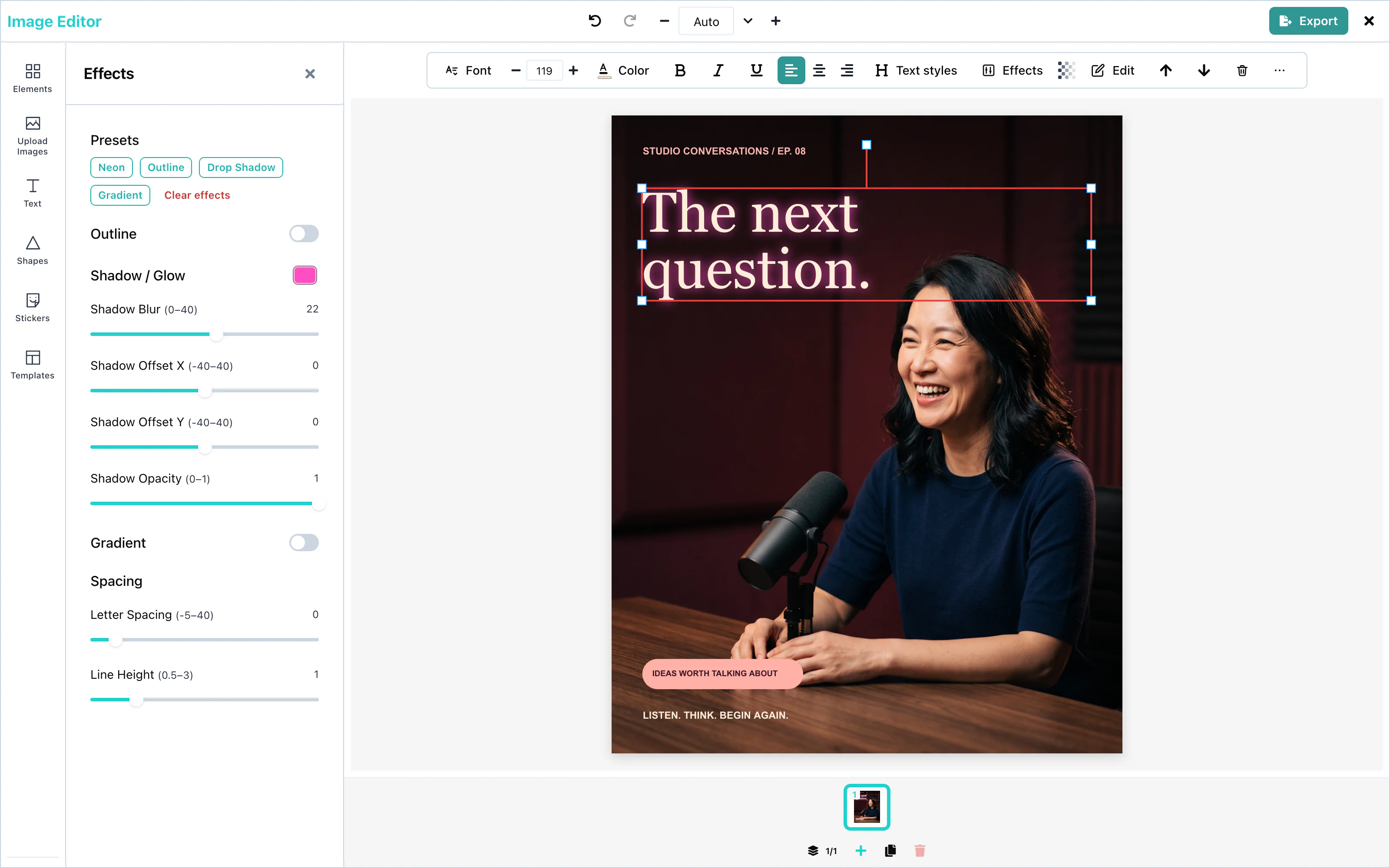 View full size
The same panel sets Letter Spacing, from -5 to 40, and Line Height, from 0.5 to 3.
Gradient text
The Gradient switch in the Effects panel fills the letters with a color gradient, from the Start color at the top to the End color at the bottom. The default colors are #fbbf24 and #f97316.
The gradient is linear and runs from top to bottom, over the height of one line.
Text templates
The Text panel’s Styles section shows four templates and a See all view. The full view has search, purpose categories (Title, Button, Call to action, Sale, Price, Lower third, Quote, Testimonial, Social handle, Announcement, Countdown and Caption), then style categories (Bold, Elegant, Script, Neon, Outline and More for Gradient, Shadow and Minimal). Brand styles appear first when a brand is active. AI-made templates appear first with an AI badge. There is no Label category.
A template is a group of text and simple shapes. With one text selected, choosing a template replaces it, puts its words in the template’s main line and keeps its size. With several texts selected, each becomes its own group. A style-locked text cannot be put into a template. With no text selected, choosing a template adds the group. See Text templates for the host setting and AI format.
AI text generation
The Text panel has one AI form. Generate with AI opens it for new wording. With text selected, the button is Rewrite with AI and + New starts a new item. In the form, choose Words or Text template; with a selection the choices read Change the words and Put it in a template. The single prompt is kept when you switch. Results preview on the canvas when selected. Generate more appends results; Try again replaces them. Add to canvas keeps the form open. See AI providers and Text templates.
AI rewrite
The toolbar action Rewrite with AI opens the Text panel’s AI form in rewrite mode. The right-click action opens the same form. Selecting a result previews it on the existing text; closing with ✕, pressing Escape, or changing selection keeps the chosen result as one undoable edit. + New switches to a new text item. The prompt is shared with text-template generation and stays when the operation changes.
Configuration
| Prop | Type | Default | Description |
|---|---|---|---|
textTemplates | AITextTemplatesSettings | none | Adds host categories and templates to Styles. Invalid entries are dropped with a console warning. See Text templates. |
googleFonts | { hosted: true }, { endpointUrl }, or { requestFn } | Built-in families | Where the Font panel gets the whole Google Fonts catalog. Without the catalog, 25 popular families are listed. |
googleFontsApiKey | string | none | Deprecated. Sends your Google key from the browser. Use googleFonts. |
templateMetadata.textStyles | object | none | Your brand's text styles, shown in Brand styles in the Text panel. |
ai | object | none | The AI provider for text, text rewriting and text-template generation. |
ai.text, ai.textRewrite, ai.textTemplate | false or object | operation-dependent | Configure or disable each operation. Hosted text-template generation is off unless you explicitly set ai.textTemplate. |
typography | object | none | The fonts of the editor's own buttons and panels, not of the design. See Theming. |
Events
Text has no events of its own. The words are part of the design, and they reach you in the exported file through onExport. See Events.
Troubleshooting
Images
Use HTTPS for mediaApiUrl. HTTP is allowed only on your own computer at the loopback addresses.
Pictures come from the user's computer, from stock photo services, or from an AI model. On the page, the user can crop, fit, and filter a picture, and remove its background.
Upload, crop, fit modes, and filters work with no setup. The other options need a key, a server, or an AI provider, which you pass as props.
<ImageEditor
  mediaApiUrl="https://media.example.com"
  stockMediaApis={{
    pexels: { apiKey: 'YOUR_PEXELS_KEY' },
    unsplash: { apiKey: 'YOUR_UNSPLASH_ACCESS_KEY', showAttribution: true },
  }}
  ai={{ endpointUrl: 'https://api.example.com/ai' }}
/>| Option | Prop | Configuration page |
|---|---|---|
| Stock photos | stockMediaApis | Stock media |
| Background removal | mediaApiUrl | AI providers |
| Image generation, AI image editing | ai | AI providers |
Upload
The Upload Images button in the upload panel opens the file picker. The user can choose several files at once.
The panel lists JPG, PNG, GIF, and WebP. A file that is not an image is refused with the message "Invalid file type".
A new picture is placed with the Fit mode, so the whole picture shows on the page.
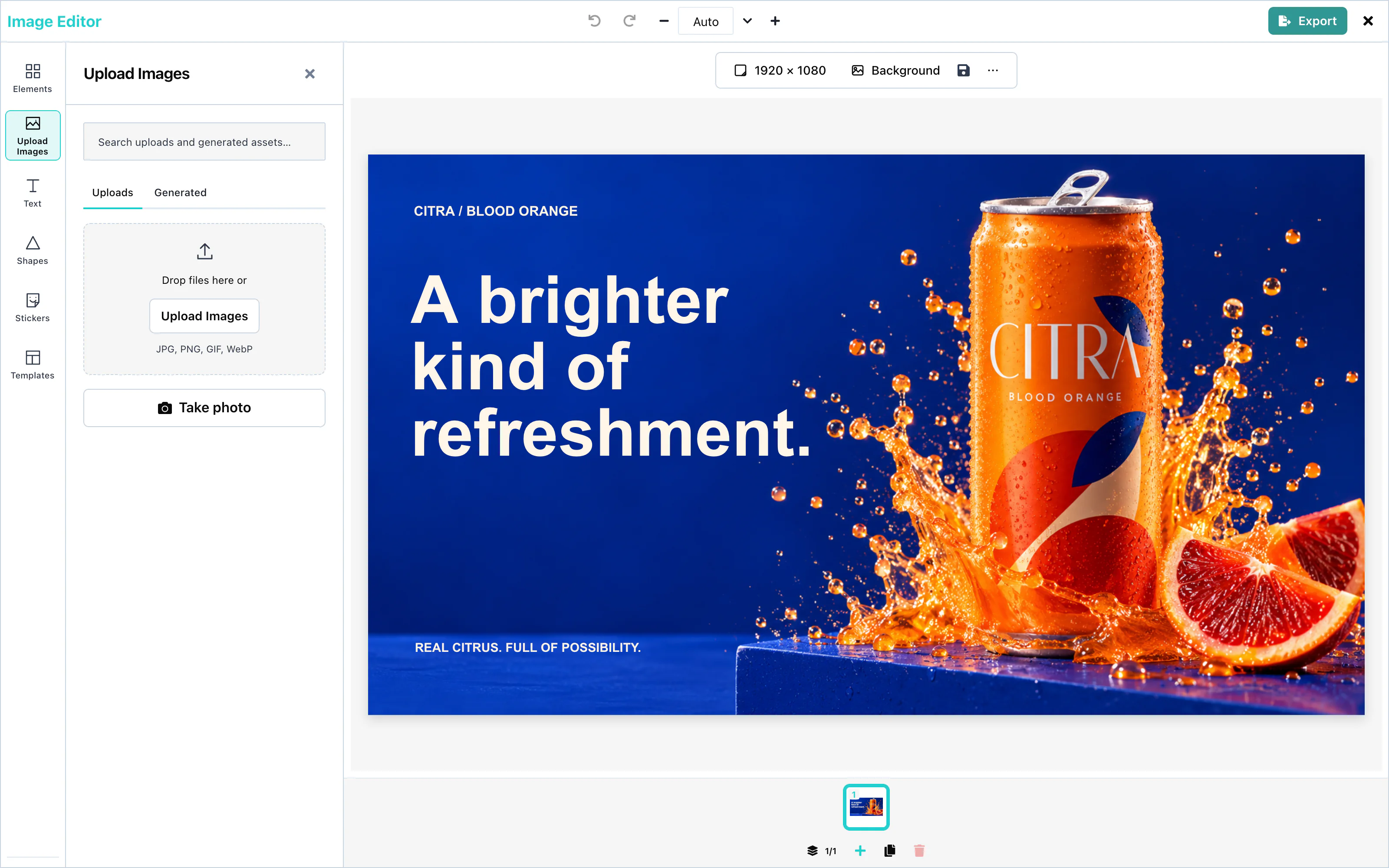 View full size
Stock photos
With stockMediaApis set, the upload panel shows a Stock Images tab, with one tab for each service. A search asks for pictures in the orientation of the page: landscape, portrait, or square.
<ImageEditor
  stockMediaApis={{
    pexels: { apiKey: 'YOUR_PEXELS_KEY' },
    unsplash: { apiKey: 'YOUR_UNSPLASH_ACCESS_KEY', showAttribution: true },
  }}
/>Unsplash requires showAttribution: true, so the photographer's name is shown with each picture.
An apiKey is visible to anyone who opens the page. In production, pass endpointUrl instead, so that the key stays on your server. See Stock media.
Crop
Crop shows part of a picture. Select a picture and press Crop in the toolbar above the page, or choose Crop in the right-click menu. In the compact layout, Crop is a chip under the picture. A frame opens over the picture. Drag the frame or its handles to choose the part that shows.
Press Done, press Enter, or click outside the frame to apply the crop. Press Cancel or Esc to leave the picture as it was. Clear crop shows the whole picture again. A crop is one step to undo, and the exported file shows exactly the same part of the picture.
A saved design keeps the crop in a crop field on the picture, { x, y, width, height }, counted in the picture's own pixels, not in page pixels. Store it with the rest of the record.
Fit modes
A fit mode decides how a picture fills the page. Select a picture and press Image Fitting Options in the toolbar above the page.
| Mode | What it does |
|---|---|
| Fit | Shows the whole picture. Borders appear if the shapes differ. This is the default. |
| Fill | Fills the page and cuts off what does not fit. |
| Stretch | Fills the page and changes the picture's proportions if needed. |
| Center | Keeps the picture at its own size, in the center. Borders can appear. |
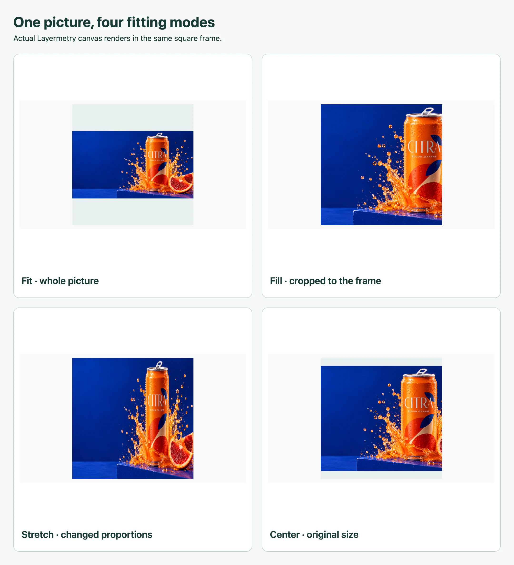 View full size
Filters and adjustments
Select a picture and open the Effects panel. Four filters switch on and off: Grayscale, Sepia, Invert, and Emboss.
Eleven adjustments take a number:
| Adjustment | Range |
|---|---|
| Blur | 0 to 10 |
| Brightness | 0 to 200 |
| Noise | 0 to 100 |
| Pixel Size | 1 to 10 |
| Contrast | 0 to 2 |
| Corner Radius | 0 to 100 |
| Shadow | 0 to 50 |
| Offset X, Offset Y | -50 to 50 |
| Shadow Offset X, Shadow Offset Y | -50 to 50 |
Filters and adjustments appear in the exported file.
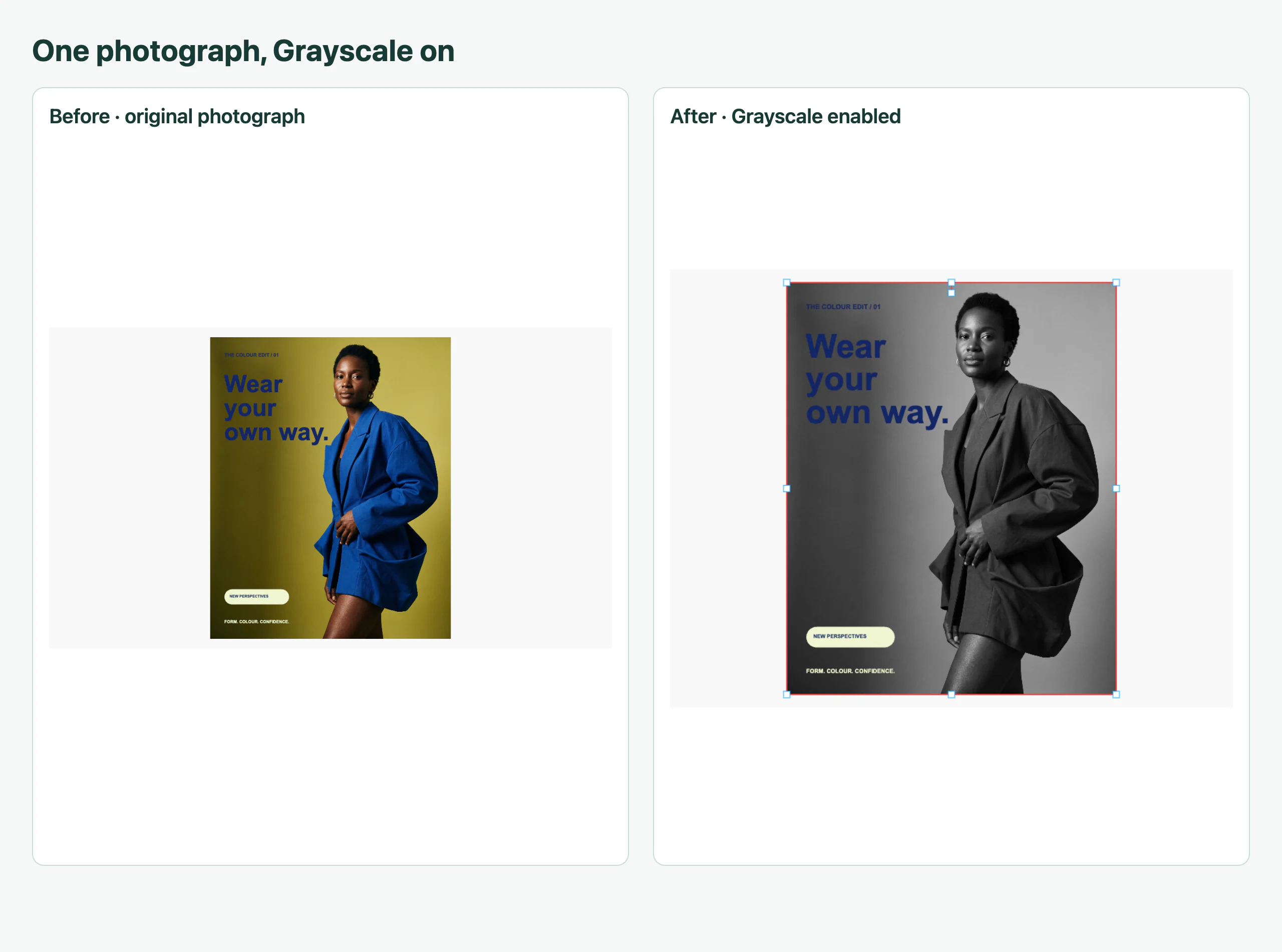 View full size
Background removal
mediaApiUrl. ai={{ hosted: true }} uses Layermetry’s service. Hosted AI is coming soon. Available only with an enterprise licence from Layermetry. See AI providers.Select a picture and press Remove Background in the toolbar, or choose Remove background in the right-click menu. The editor replaces the picture with the one your server returns, at the same place and size.
Image generation
ai. See AI providers.With ai set, the upload panel shows Generate image. The user describes the picture and presses Generate.
The results appear in the box. Choose a picture and select Add to canvas to place it. Generate more appends results; Try again replaces the current choices. Every picture made in the session stays in the Generated tab.
<ImageEditor
  ai={{ endpointUrl: 'https://api.example.com/ai' }}
/>AI image editing
ai. See AI providers.Select a picture and press Edit with AI in the toolbar, or choose Edit with AI… in the right-click menu. The user describes the change, for example "put two passengers in the boat", and presses Generate.
The box offers starts such as Change the background and Add something. The first suggestion previews on the picture. Click a card to compare it; choose Original to restore the source. Closing the box keeps the selected result as one editing action, with one Undo step.
The request has "operation": "imageEdit" and carries the picture in input.source. The answer has the same { items: [{ url }] } format as image generation.
When you pass onUploadAsset, the editor gives it the new picture before the picture is replaced, so the design keeps your own address. Without onUploadAsset, the picture's data is saved inside the design. See Asset storage.
Upscaling
Coming soonUpscaling will increase the resolution of a picture.
Masks
Select a picture and press Mask beside Crop to hide part of it. Choose Rectangle, Rounded, Circle, Star, Polygon, Linear, or Shape…, then move, resize, or rotate the mask. Invert hides the inside instead, and Feather softens the edge. Press Enter or click outside to apply it, or press Esc to cancel. In compact layout, use Done or Cancel. Clear mask removes the mask without changing the crop.
Masks work on pictures and GIFs, including pictures used as stickers. Backgrounds cannot be masked. A new mask is rectangular, inset 10% on each side, with no feather or inversion. Rounded corners and feather range from 0–50%; stars and polygons accept 3–12 points or sides. Mask controls are enabled by default; set ui={{ features: { masks: false } }} to hide them.
When the user edits a masked picture with AI, the request includes input.mask alongside input.source. White pixels identify the editable area, black pixels protect the rest, and gray pixels describe the feathered edge. Your provider must support mask input to honor that region.
Configuration
| Prop | Type | Default | Description |
|---|---|---|---|
stockMediaApis | object | none | Pexels and Unsplash settings. Without it, the Stock Images tab does not appear. |
mediaApiUrl | string | none | The address of the media server that removes backgrounds. ai={{ hosted: true }} uses the Layermetry address. Hosted AI is coming soon. Available only with an enterprise licence from Layermetry. |
ai | object | none | The AI provider. Without it, no AI control appears and no AI request is sent. |
onUploadAsset | function | none | Stores pictures that were changed with AI in your own storage. |
Events
Images have no events of their own. The editor calls onUploadAsset when the user keeps a picture changed with AI. The finished design reaches you through onExport. See Events.
Troubleshooting
Shapes
Shapes are vector elements: rectangles, circles, stars, arrows, lines, speech bubbles, and more. The user sets their fill color, outline color, and outline width. With an AI provider, the user can also describe a new shape.
Shapes work with no setup. AI shape generation needs an AI provider:
<ImageEditor
  ai={{ endpointUrl: 'https://api.example.com/ai' }}
/>Shape library
Open the Shapes panel in the tool rail, or press Add shape in the toolbar above the page. A click on a shape adds it to the page and selects it.
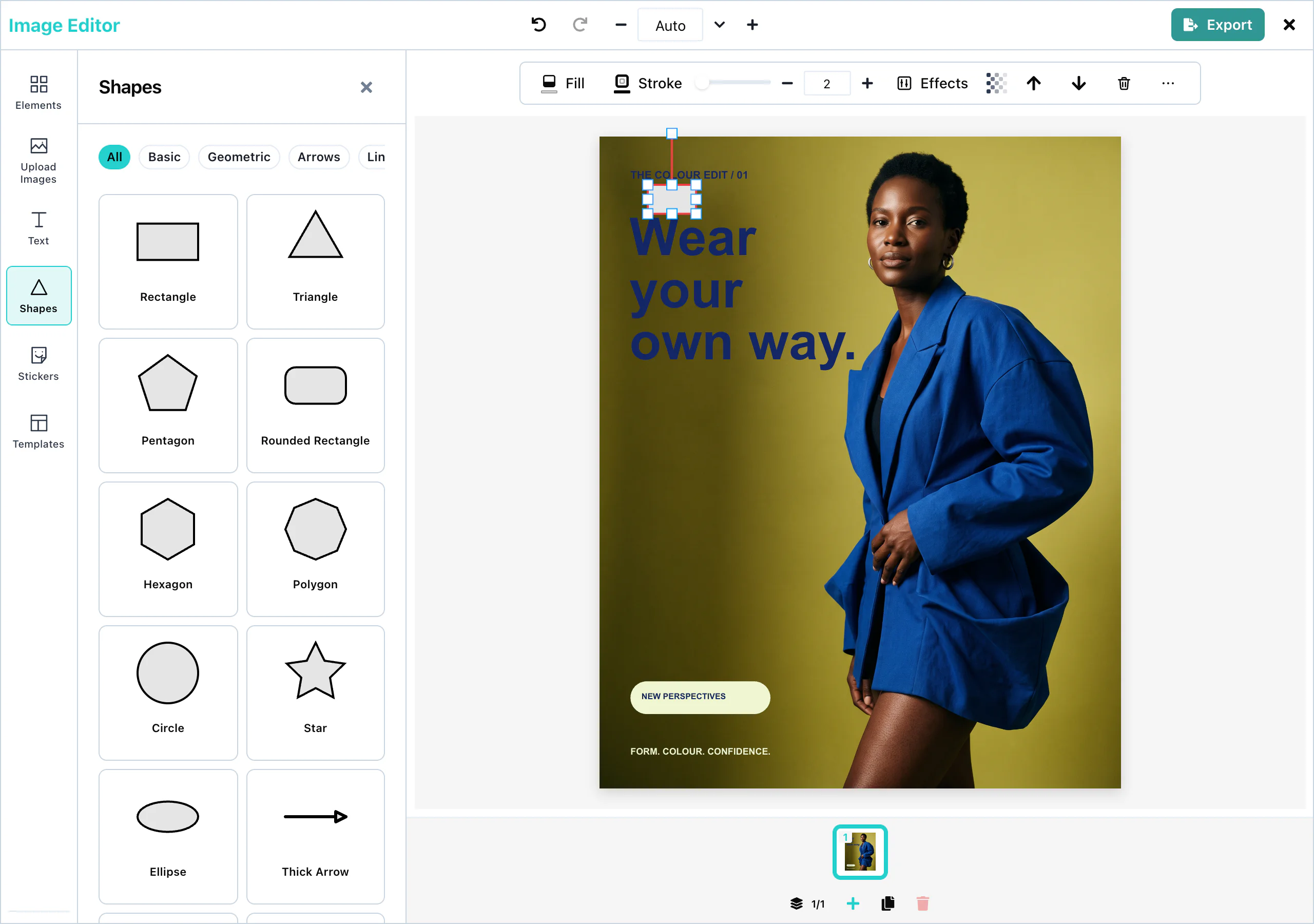 View full size
The panel has 43 shapes, in six categories:
| Category | Shapes |
|---|---|
| Basic | Rectangle, Rounded Rectangle, Circle, Ellipse, Squircle, Pill |
| Geometric | Triangle, Pentagon, Hexagon, Polygon, Ring, Diamond, Parallelogram, Trapezoid, Right Triangle, Semicircle, Quarter Circle |
| Arrows | Thick Arrow, Arrow Up, Arrow Down, Arrow Left, Arrow Right, Double Arrow, Curved Arrow |
| Lines | Line, Divider, Dashed Line, Dotted Line, Arrow Line, Double Arrow Line |
| Organic | Soft Blob, Blob Two, Blob Three |
| Symbols | Star, Chevron, Cross, Heart, Star 4, Star 6, Badge, Speech Bubble, Callout, Octopus |
All shows every shape. A new shape is light gray (#E5E5E5) with a black outline.
Fill and stroke
Select a shape. The toolbar above the page shows:
| Control | What it changes |
|---|---|
| Fill color | The color inside the shape. |
| Stroke color | The color of the outline. |
| Stroke width | The width of the outline. The slider goes from 0 to 40. You can type any value, with decimals, such as 0.5. |
| Transparency | How see-through the shape is, from 0 to 100. |
The color pickers offer a color field, hex and RGB values, and a row of ready-made colors.
A stroke width of 0 removes the outline. Fill is a solid color. For effects such as a shadow or rounded corners, use the Effects panel. See Effects and filters.
Lines and arrows
The Lines category adds straight lines: a solid, dashed, or dotted line, a line with one arrowhead, or a line with two. A new line is 200 pixels long and horizontal.
Select a line to see a handle at each end. Drag a handle to change the length and the angle of the line. The color of a line is its stroke color, and its thickness is its stroke width.
The Arrows category adds filled arrow shapes, which resize like any other shape.
AI shape generation
ai. See AI providers.With ai set, the Shapes panel shows Generate shape at the top. The user describes the shape, for example "a simple triangle", and presses Generate. The count line shows the number of returned outlines. Add to canvas adds the chosen shape to the page.
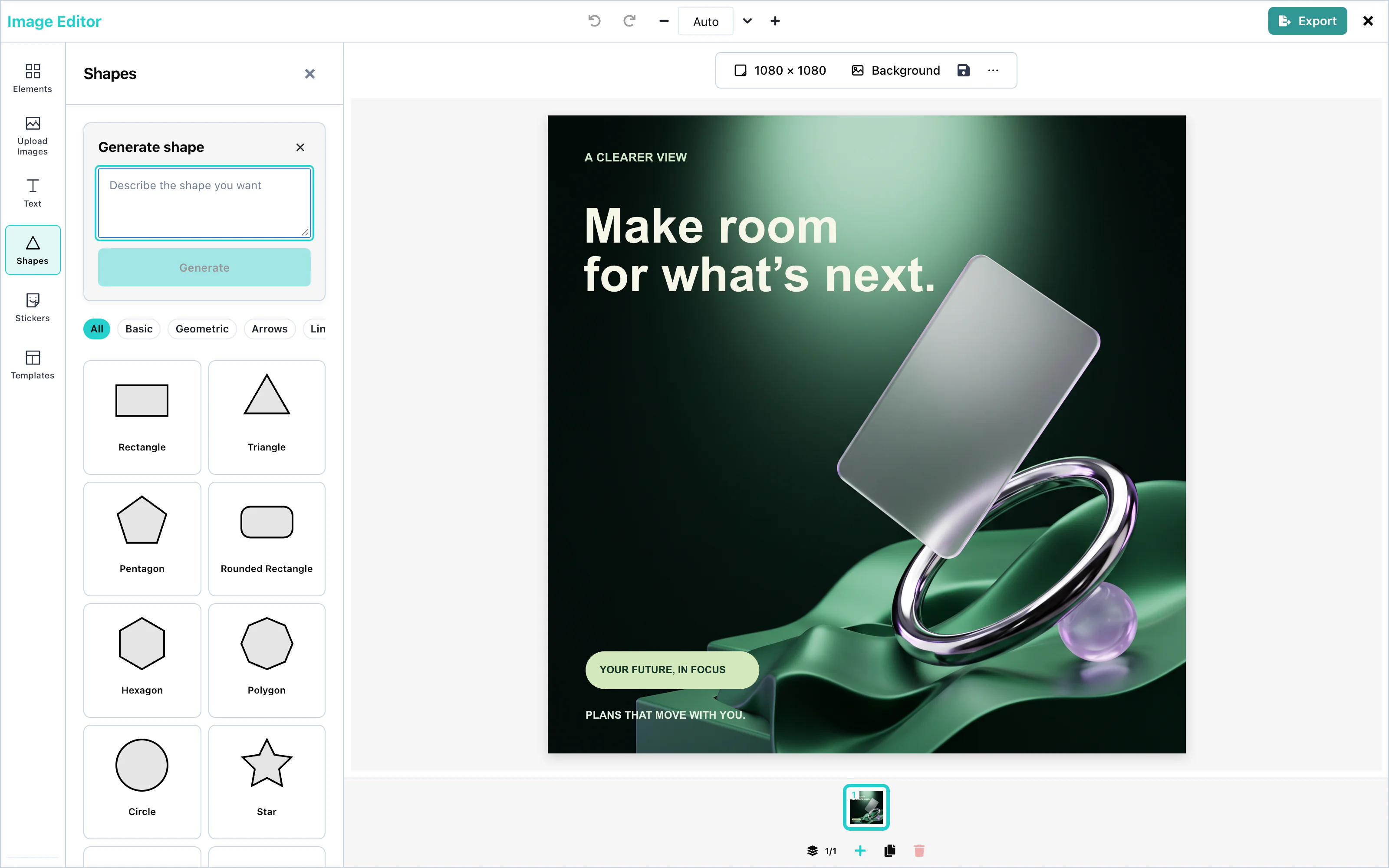 View full size
A generated shape is a vector path. It has the same fill and stroke controls as the other shapes.
The request has "operation": "svgPath", and your AI server answers with { items: [{ pathData }] }, with SVG path data in each entry. See Custom AI endpoint.
Configuration
| Prop | Type | Default | Description |
|---|---|---|---|
ai | object | none | The AI provider for Generate shape. Without it, the button does not appear. |
ai.svgPath | false or object | on | false hides Generate shape. |
Events
Shapes have no events of their own. They are part of the design, and they reach you in the exported file through onExport. See Events.
Troubleshooting
Stickers
Stickers are small ready-made pictures. The editor has a built-in set, and you can add GIPHY, your own collections, or your own sticker service. Each collection is a source in the stickers prop.
The built-in stickers work with no setup. This example adds a collection of your own and GIPHY:
<ImageEditor
  stickers={{
    sources: [builtInStickers(), brandStickers, giphyStickers({ endpointUrl: 'https://api.example.com/giphy' })],
  }}
/>Built-in stickers
Open the Stickers panel in the tool rail. Without the stickers prop, it shows the built-in collection Essentials: Heart, Star, Sparkle, and Check mark. They are drawings inside the package, so they load with no network request.
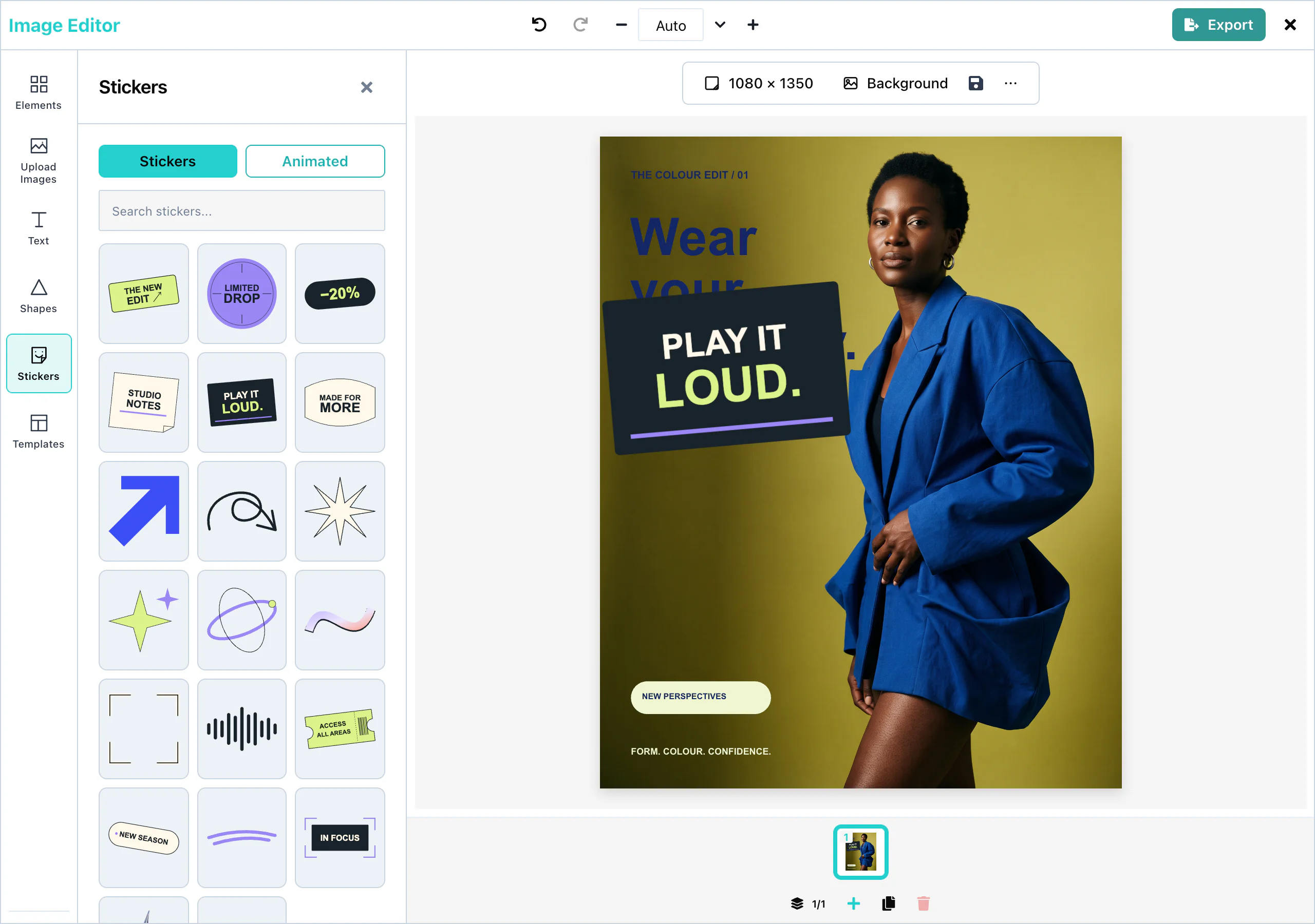 View full size
A click on a sticker adds it to the page. When there is more than one source, a row of source names appears under the tabs. The search field searches the source that is selected.
When you pass stickers, list builtInStickers() yourself if you want to keep the built-in collection. stickers={{ sources: [] }} removes the Stickers tool from the editor.
GIPHY
giphyStickers() adds the GIPHY sticker library as a source. Before the user types, it shows the trending stickers. Results arrive 24 at a time, and Load more shows the next 24.
<ImageEditor
  stickers={{ sources: [builtInStickers(), giphyStickers({ endpointUrl: 'https://api.example.com/giphy' })] }}
/>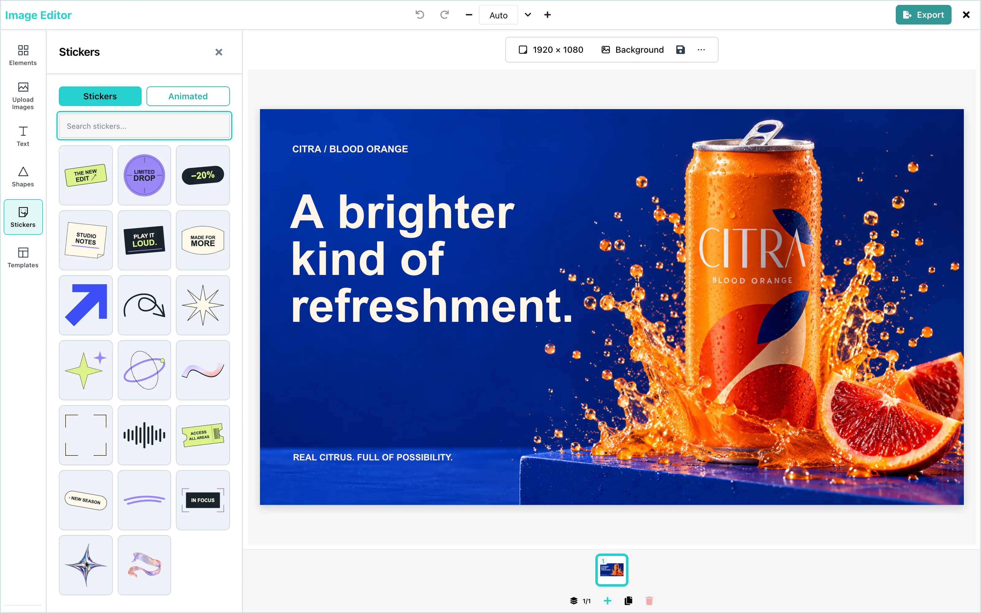 View full size
GIPHY content is rated pg.
Animated GIFs
The Animated tab shows the stickers that move. A sticker moves on the page when it comes from this tab.
A sticker from the Stickers tab is still. The editor adds the first frame of the picture.
For a GIPHY sticker to appear on the Animated tab, its moving version must be 4 MB or smaller. Larger stickers appear on the Stickers tab only.
PNG, JPEG, and PDF files cannot move. An export holds one frame of each moving sticker.
Custom sticker packs
staticStickers() turns a list of pictures into a source:
<ImageEditor
  stickers={{ sources: [brandStickers] }}
/>The search field finds a sticker by its title or its id. A .gif or .webp picture appears on the Animated tab too.
Each sticker item has these fields:
| Field | Type | Description |
|---|---|---|
id | string | Unique in the source. |
title | string | The name. It is shown to screen readers as "Add" and the title. |
url | string | The picture. It must allow cross-origin requests. |
animatedUrl | string | A moving version, for the Animated tab. |
thumbnailUrl | string | A small picture for the panel. Default: url. |
width, height | number | The size in pixels on the page. |
Your own sticker service
A source is an object with id, label, and a search function. trending is optional: without it, the source shows nothing until the user types.
<ImageEditor
  stickers={{ sources: [companyStickers] }}
/>search receives limit 24 and an offset that grows by 24 with each Load more. It returns { items, hasMore }. Each source keeps its own results. The editor never mixes the results of two sources.
Configuration
| Prop or export | Description |
|---|---|
stickers | { sources: StickerSource[] }. Default: the built-in collection. { sources: [] } removes the Stickers tool. |
builtInStickers() | The built-in collection Essentials. |
giphyStickers(options) | GIPHY. Options: one of apiKey, endpointUrl, or requestFn, and id and label. See Stock media. |
staticStickers({ id, label, items }) | A fixed list of pictures. |
The three functions are exported from both @layermetry/media-editor and @layermetry/media-editor/react.
Events
Stickers have no events of their own. They are part of the design, and they reach you in the exported file through onExport. See Events.
Troubleshooting
Backgrounds
The background fills the whole page, behind every other element. It is a solid color, a gradient, a photo, or a blurred copy of a picture on the page. Each page of a design has its own background. A new page is white.
Colors, gradients, uploaded photos and blurred copies work with no setup. The Unsplash photo search needs your Unsplash key, and Generate background needs an ai setting that serves pictures:
<ImageEditor
  stockMediaApis={{
    unsplash: { endpointUrl: 'https://api.example.com/unsplash', showAttribution: true },
  }}
/>Open the Background panel in the tool rail. At the top is Generate background, when your ai setting serves pictures. Below it are three tabs: Solid Color, Gradient, and Image.
Solid color
On the Solid Color tab, a click on one of the 16 Preset Colors fills the page at once. For another color, choose it under Custom Color and press Apply Color.
The presets are white, black, two grays, and twelve bright colors, from red (#ef4444) to purple (#a855f7).
The color stays with the page when the user changes the background to a gradient, a photo, or a blurred copy. It is the fallback color: the page and the exported file show it whenever the background cannot be drawn. That happens while a photo has not loaded, when the colors of a gradient cannot be read, and when the picture of a blurred copy is deleted. A new page starts with white.
Gradient
On the Gradient tab, a click on one of the 8 Gradient Presets fills the page with a gradient. For your own gradient, choose the Start, Middle, and End colors under Custom Gradient, and press Apply Custom Gradient.
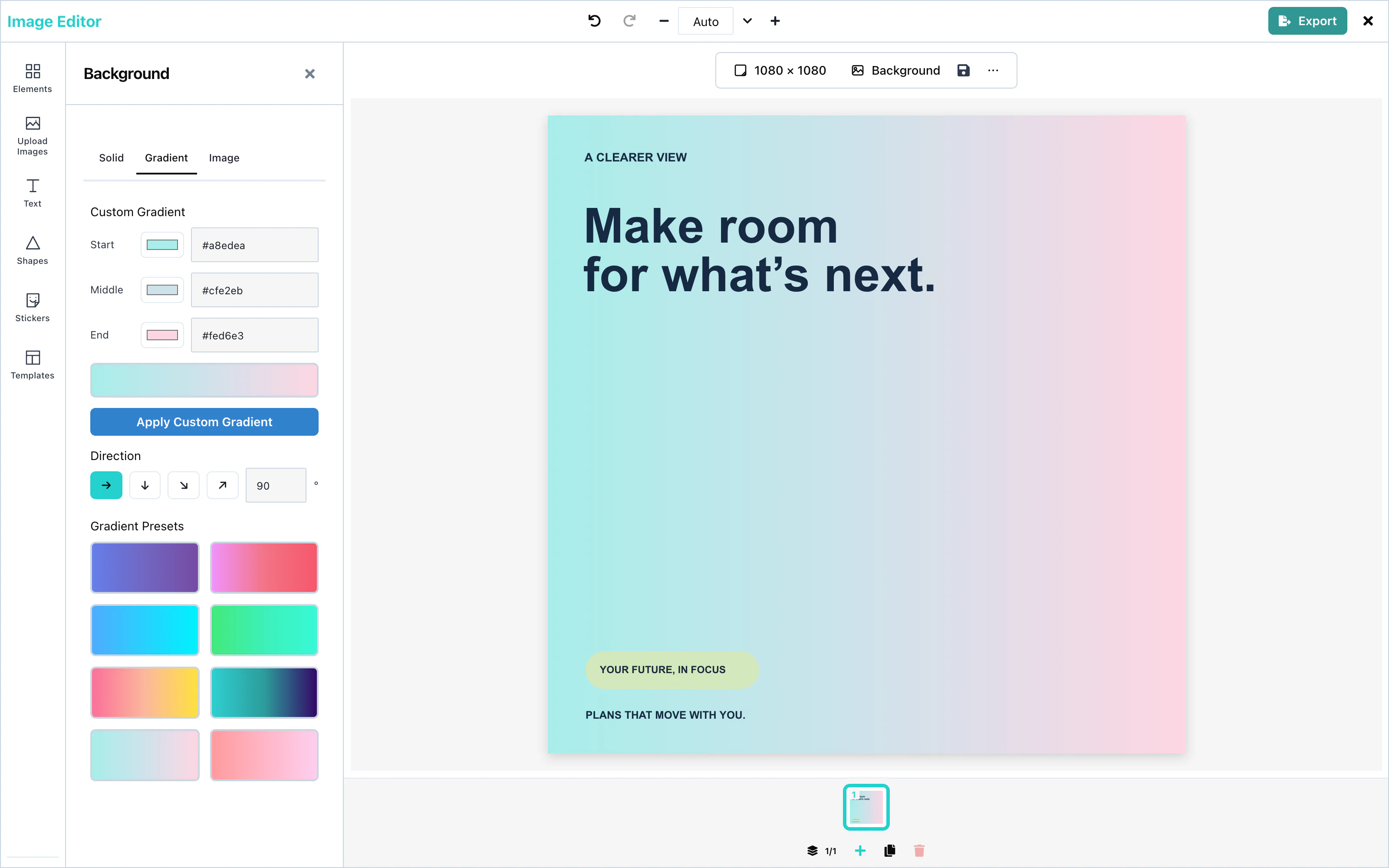 View full size
Under the colors, Direction says which way the gradient runs: → (left to right, the default), ↓ (top to bottom), ↘ and ↗ (the two diagonals). For any other direction, type a number of degrees from 0 to 359 and press Enter.
Image
The Image tab puts a picture behind the page. It has, from top to bottom:
- From this design: one tile for each picture on the page. Press a tile to make the background a blurred, darkened copy of that picture. See Blurred background.
- Upload a picture: choose a picture file from the computer.
- The Unsplash search, when Unsplash is connected. It starts with the search "backgrounds". The photographer's name is shown on each photo, as Unsplash requires. Load More shows the next 15 photos.
- Blur and Darken, whenever the background is a photo or a blurred copy.
A photo fills the whole page. It keeps its proportions, it is centered, and the parts that do not fit are cut off equally from both sides.
Blur softens the photo, from 0 (sharp) to 40 pixels. Darken puts black over it, from 0 to 100 %. Both help text on top stay readable. The page changes once, when the slider is let go.
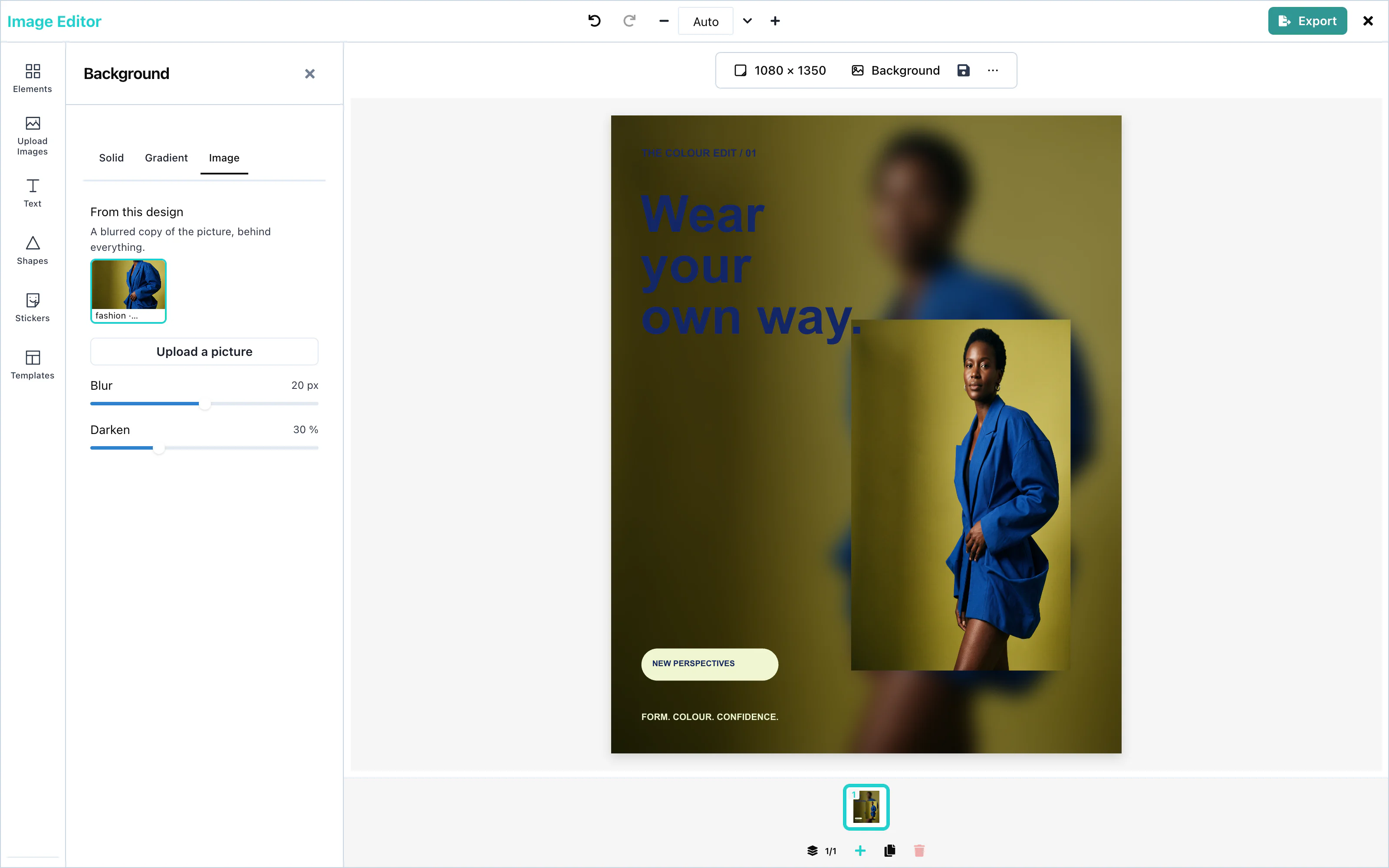 View full size
Blurred background
A blurred background fills the page with a soft, darkened copy of a picture on the page. Put a picture on the page first, then either press its tile under From this design on the Image tab, or right-click the picture and choose Use as blurred background.
A new blurred copy starts at Blur 20 pixels on a page 1080 pixels on its short side (the number follows the short side, from 0 to at most 40) and Darken 30 %. If the background was already a photo or a blurred copy, its own Blur and Darken are kept. Adjust both with the sliders. When the page is resized with Scale, the blur grows or shrinks with the page's short side.
If the copied picture is deleted, the background shows its fallback color (see Solid color).
Generate background
ai setting that serves pictures. See AI providers.Press Generate background at the top of the panel, describe the picture, and press Generate. Choose a result and press Set as background. It becomes the background of the page.
A host that shows AI pictures in panels shows this control too. To remove it, leave 'panel' out of ui.generative.actions.image.surfaces. That also removes the generate control from the Upload panel.
Configuration
| Prop | Type | Default | Description |
|---|---|---|---|
stockMediaApis.unsplash | object | none | Unsplash photo search on the Image tab. Without it, the tab still offers From this design and Upload a picture. |
ai | object | none | A picture capability adds Generate background. |
To leave the background out of an exported PNG, tick Transparent background in the export panel. See Transparent background.
Events
The background has no events of its own. It is part of the design, and it reaches you in the exported file through onExport. See Events.
Troubleshooting
Pages
A design can have up to 10 pages, for example the slides of a social media carousel. Each page has its own size and background. The user adds, duplicates, and deletes pages in the page list under the page.
Multi-page designs work with no setup. The page list appears by default; ui.chrome.pages: false hides it.
Use the editor from Usage; these controls need no additional props.
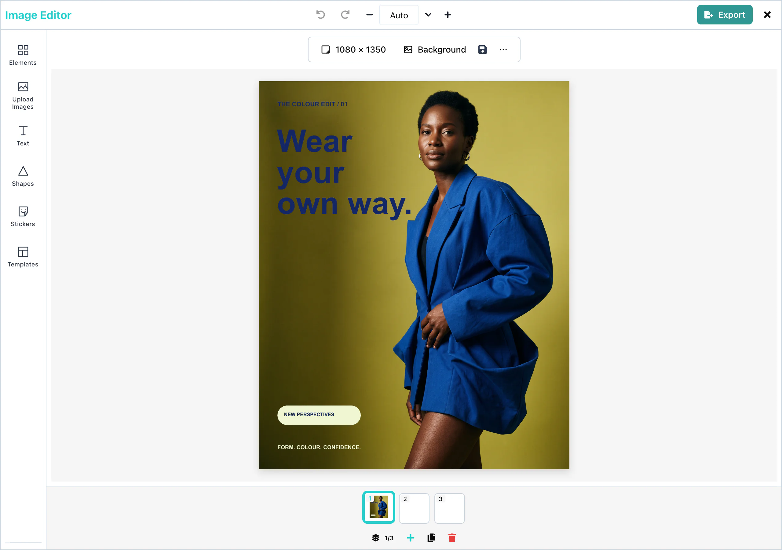 View full size
The page list shows a thumbnail of each page. A click on a thumbnail opens that page. The counter, for example 2/3, shows the open page and the number of pages. A click on the counter opens Pages, a larger view of all pages.
Adding pages
Add page (the plus button) adds an empty page at the end. A new page is 1080 × 1080 pixels, with a white background. The page that is open stays open.
A design holds at most 10 pages. At 10 pages, Add page is not available, and the editor says "You can only have 10 pages."
To change the size of a page, see Resizing.
Duplicating pages
Duplicate page copies the open page, with its size, its background, and all its elements. The copy comes right after the original, and the copy opens.
Use it to make the slides of a carousel look alike: design the first slide, duplicate it, and change the words.
Deleting pages
Delete page deletes the open page at once, with no question. Undo does not bring a page back. The page before it opens, or the next page when the first page was deleted.
A design always has at least one page. With one page, Delete page is not available.
In the Pages view, each page has its own duplicate and delete buttons.
Page export
When a design has more than one page, the export panel shows Pages to export, with a box for each page. Every page is ticked when the panel opens.
| Format | Result for several pages |
|---|---|
| One PDF file, with one PDF page for each design page. | |
| PNG, JPEG | One ZIP file, with one picture for each page: page-1.png, page-2.png, and so on. |
See Page selection for the details.
Configuration
Pages have no props. The page limit of 10 is fixed.
Events
Pages have no events of their own. See Events for the export.
Troubleshooting
Styling and export
Effects
The Effects panel changes how a selected element looks. Pictures and shapes get filters and adjustments. Text gets outline, shadow, gradient, and spacing. Effects appear in the exported file exactly as on the page.
Effects work with no setup:
Use the editor from Usage; these controls need no additional props.
Open the Effects panel in the tool rail, and select an element on the page. With nothing selected, the panel says "Select an image, shape, or text to apply effects".
Filter presets
On a phone, expand the Effects sheet for more room. While expanded, press Collapse beside Done, or tap the grip, to return to its default height.
Four filters change the colors of a picture or a shape. Each one is a switch under Base Effects, and they can be combined:
| Filter | Result |
|---|---|
| Grayscale | Shades of gray. |
| Sepia | Warm brown tones, like an old photo. |
| Invert | Every color becomes its opposite. |
| Emboss | A raised, stamped look. |
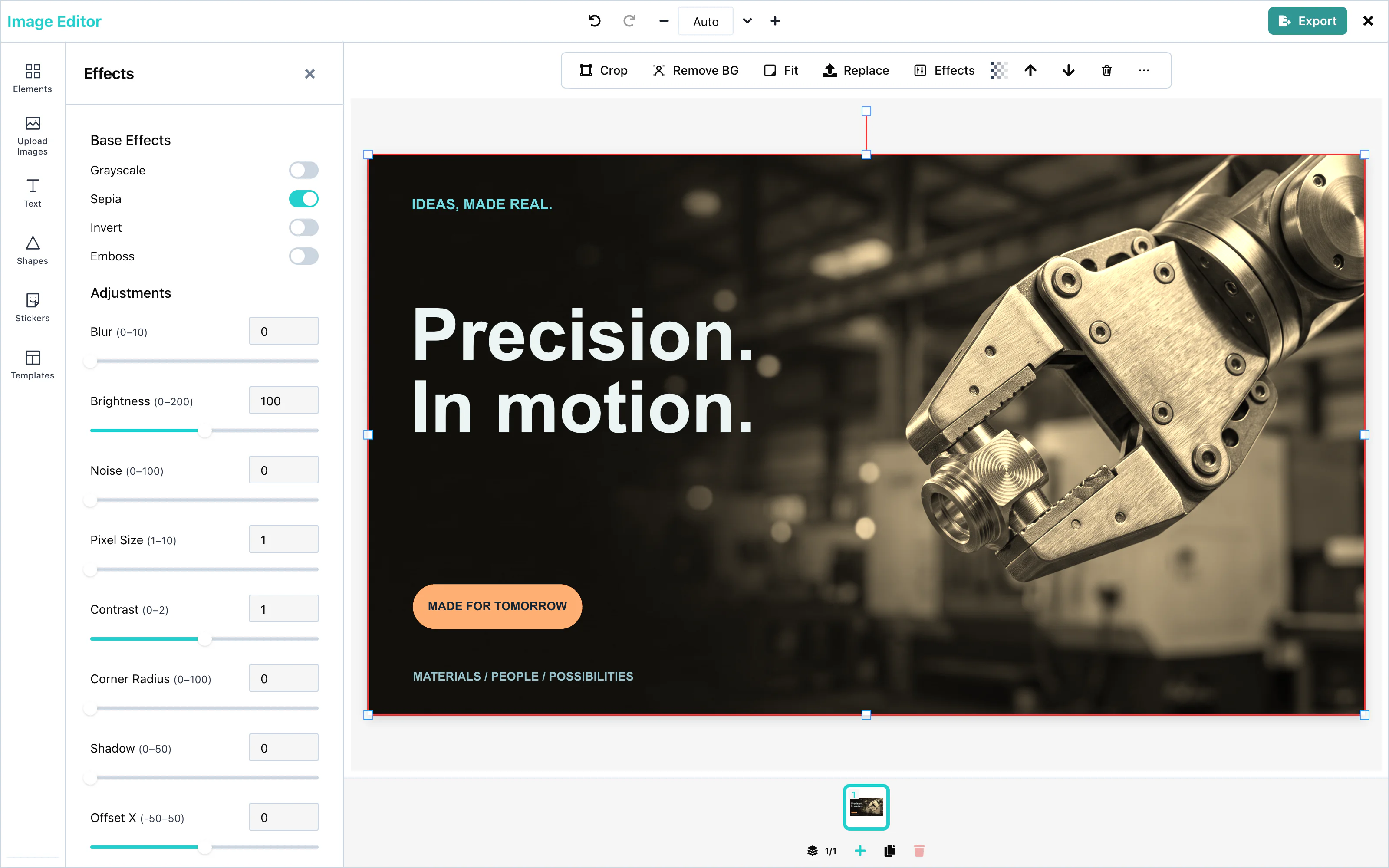 View full size
For text, the panel offers other presets. See Text effects.
Adjustments
Under Adjustments, each value has a slider and a number field. The change applies when the user releases the slider, or leaves the number field.
| Adjustment | Range | What it changes |
|---|---|---|
| Blur | 0 to 10 | Softens the picture. |
| Brightness | 0 to 200 | Makes the picture darker or lighter. 100 keeps it as it is. |
| Noise | 0 to 100 | Adds grain. |
| Pixel Size | 1 to 10 | Turns the picture into larger squares. |
| Contrast | 0 to 2 | Makes the difference between light and dark smaller or larger. 1 keeps it as it is. |
| Corner Radius | 0 to 100 | Rounds the corners. |
| Shadow | 0 to 50 | The softness of a shadow behind the element. |
| Offset X, Offset Y | -50 to 50 | Moves the picture inside its frame. |
| Shadow Offset X, Shadow Offset Y | -50 to 50 | Moves the shadow away from the element. |
A line or an arrow takes the filters, but not the shadow or the corner radius.
To make any element see-through, select it and use Transparency in the toolbar above the page, from 0 to 100.
Text effects
Select a text box, and the Effects panel shows text effects instead of filters:
| Control | What it does |
|---|---|
| Presets | Neon, Outline, Drop Shadow, and Gradient set several values at once. Clear effects removes them all. |
| Outline | A line around the letters, with a color and a width from 0 to 10. |
| Shadow / Glow | A color behind the letters, with blur, offset, and opacity. |
| Gradient | Letters filled with two colors, from top to bottom. |
| Spacing | Letter spacing from -5 to 40, and line height from 0.5 to 3. |
See Outline and shadow and Gradient text for every value.
Configuration
The Effects panel has no props. To hide the Effects tool, use ui={{ toolRail: { hidden: ['effects'] } }}. See UI customization.
Events
Effects have no events of their own. They are part of the design, and they reach you in the exported file through onExport. See Events.
Troubleshooting
Templates
A template is a saved design that users start from. Your server stores the templates. The editor lists them in the Templates panel, loads them onto the page, and saves new ones.
The template library needs two functions: one that lists templates, and one that saves them. Pass list and save callbacks to connect the library to your application:
<ImageEditor
  onSaveTemplate={saveTemplate}
  onGetTemplates={getTemplates}
  templateMetadata={{ metadata: { brand: 'acme' } }}
/>See Saving and loading for the route and the fields of a template.
Template library
onGetTemplates. See Saving and loading.Open the Templates panel in the tool rail. The editor calls onGetTemplates and shows each template as a picture. Refresh asks again. A click on a template loads it onto the open page, in place of what was there.
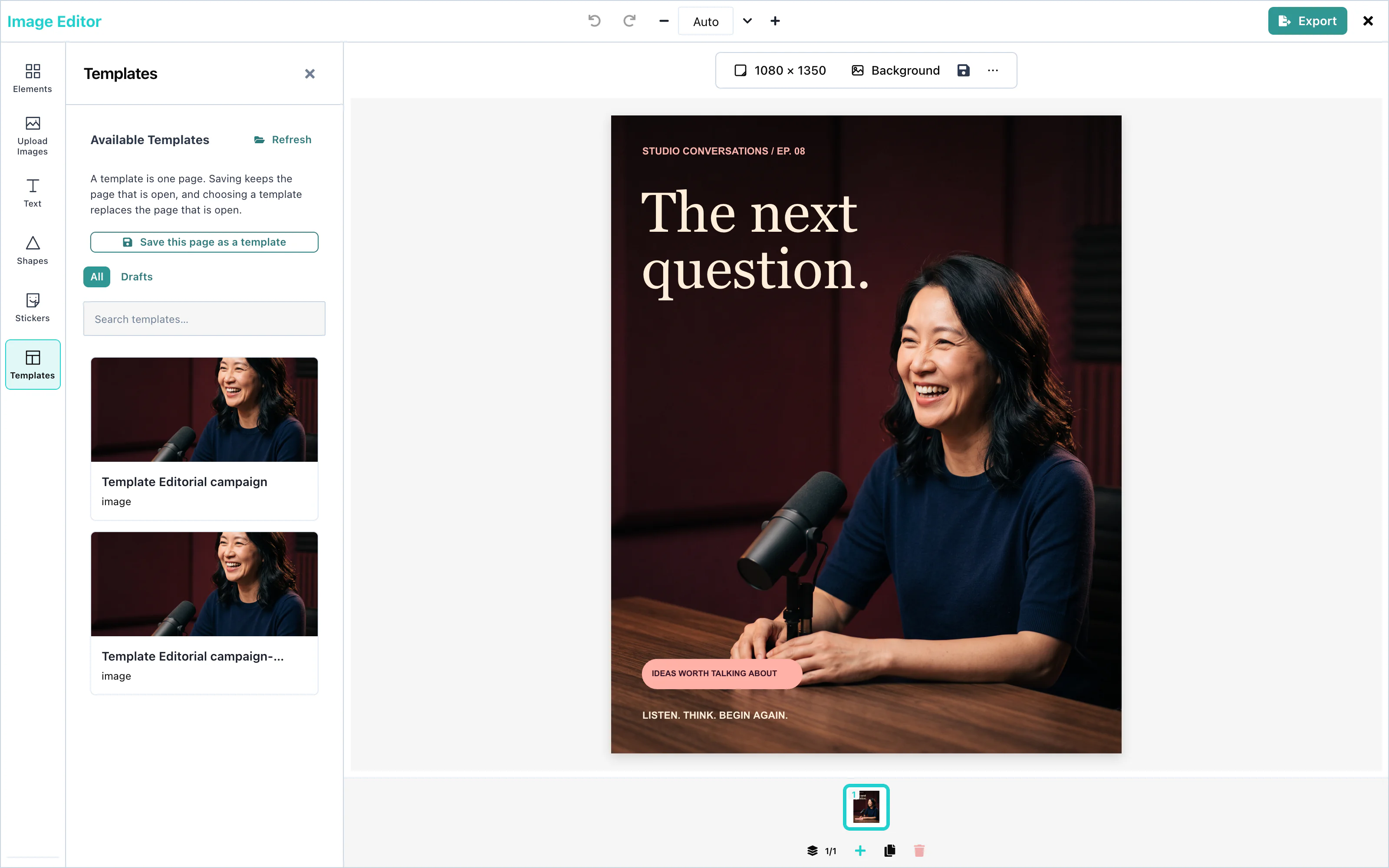 View full size
The editor waits up to 3 seconds for the fonts of the template, so that the text appears in the right font. When the template was made for another page size, templateCanvasPolicy decides what happens. See Loading designs.
To open the editor with a template already loaded, pass it as defaultTemplate.
Saving templates
With onSaveTemplate, the user saves the open page as a template, with Save this page as a template in the toolbar above the page or in the Templates panel. The toolbar button's accessible name is "Save template". The editor makes a preview picture, and calls onSaveTemplate({ template }).
A template holds one page. Saving keeps the page that is open, and choosing a template replaces the page that is open. The Templates panel says so in one line.
<ImageEditor
  onSaveTemplate={saveTemplate}
/>The new template appears the next time the panel calls onGetTemplates. Saving designs describes save success, failure, and retry behavior.
Without onSaveTemplate, no save button appears.
Drafts
A draft is a template that is not finished. Save draft in the export panel saves one, with draft: true. The Templates panel shows the drafts under Drafts, next to All.
See Drafts for automatic saving.
Text templates
The Text panel includes built-in and host-provided templates. See Text templates.
For your brand's own text looks, use templateMetadata.textStyles. See Brand text styles.
Configuration
| Prop | Type | Default | Description |
|---|---|---|---|
onGetTemplates | () => Promise<Template[]> | none | Lists the templates for the Templates panel. |
onSaveTemplate | (props) => Promise<void> | none | Saves a template or a draft. Without it, no save button appears. |
defaultTemplate | Template | none | A template on the page when the editor starts. |
templateCanvasPolicy | 'adopt', 'fit', or 'place' | 'adopt' | What happens when a template has another page size. |
templateMetadata | object | none | Your own fields, added to every saved template, and your brand's text styles. |
| onUploadAsset | function | none | Stores the pictures of a template in your storage. See Asset storage. |
Events
onSaveTemplate runs for each save. The custom element also sends a templatesave DOM event, with detail: { template, saved }. See Events.
Troubleshooting
Resizing
Resizing changes the size of the open page, for example from a square Instagram post to a tall Instagram story. The user picks a ready-made size or types a size in pixels, and chooses what happens to the elements on the page.
Resizing works with no setup. Select nothing on the page, and press Resize canvas in the toolbar above the page. In the compact layout, the tool is Resize in the dock.
Use the editor from Usage; these controls need no additional props.
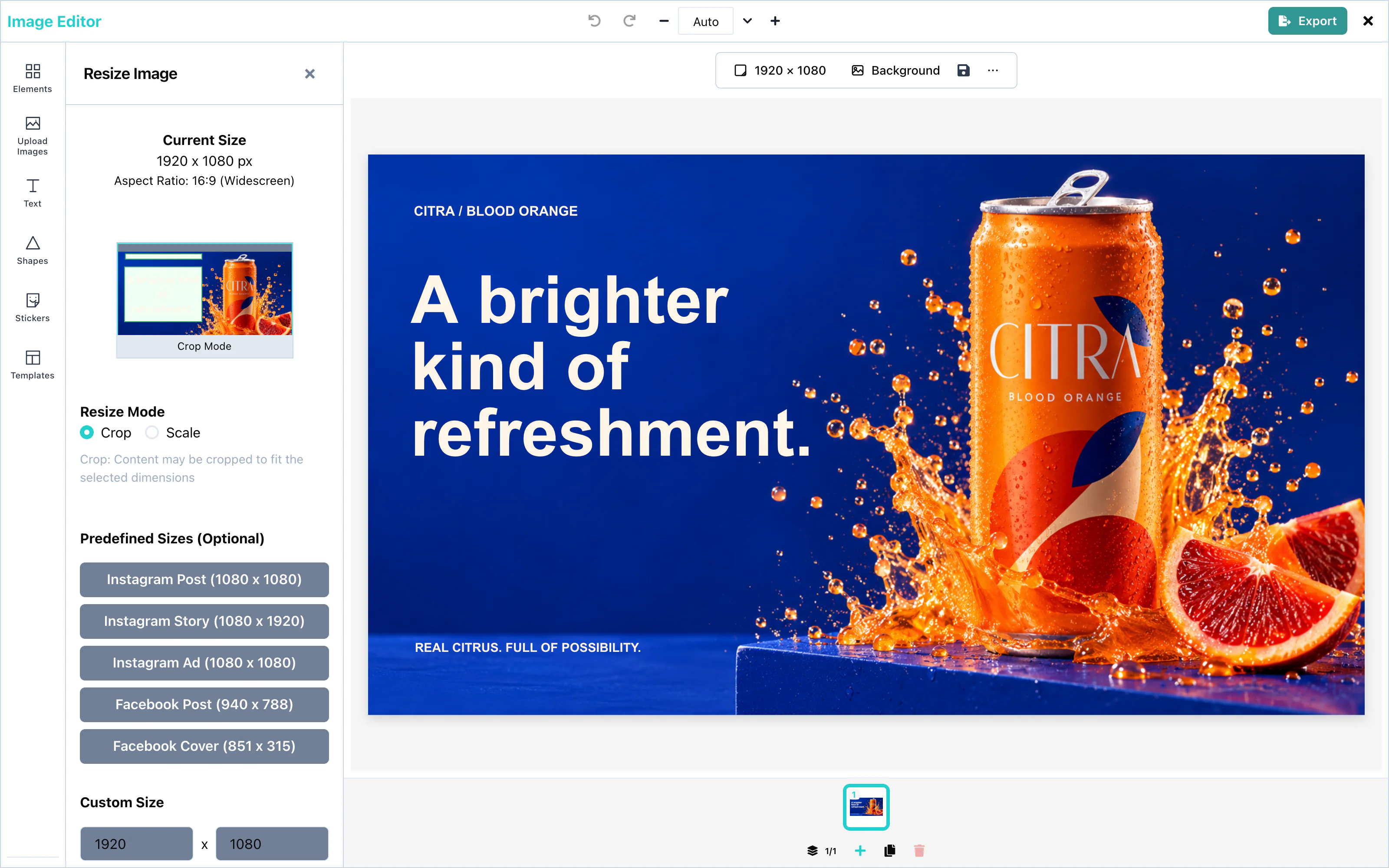 View full size
The panel shows the current size and shape of the page, for example "1080 x 1080 px" and "1:1 (Square)". Press Apply Resize to change the page.
Size presets
Under Predefined Sizes (Optional), a click selects a size. A second click on the same size clears the choice.
| Preset | Size in pixels |
|---|---|
| Instagram Post | 1080 × 1080 |
| Instagram Story | 1080 × 1920 |
| Instagram Ad | 1080 × 1080 |
| Facebook Post | 940 × 788 |
| Facebook Cover | 851 × 315 |
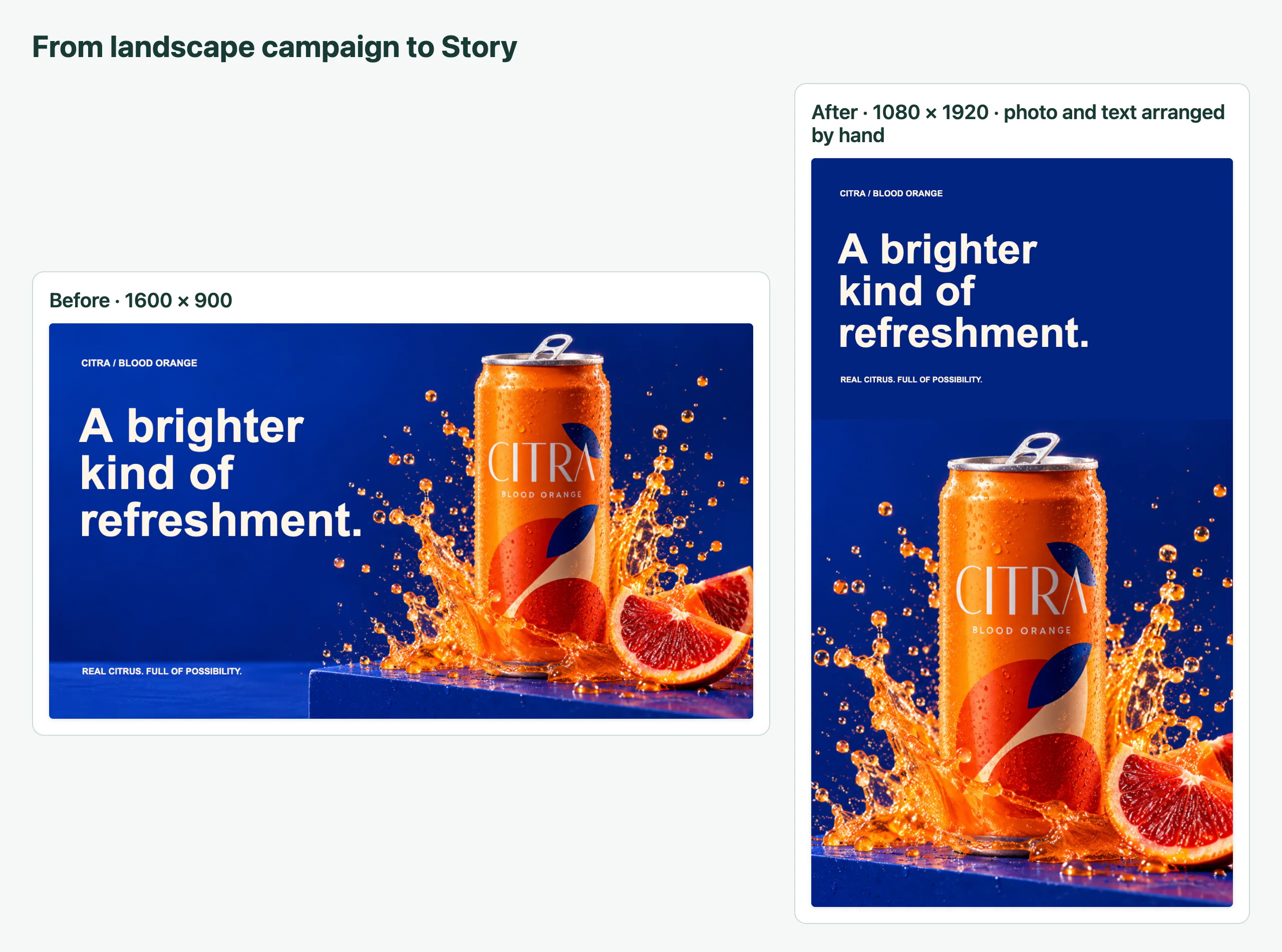 View full size
Custom sizes
Under Custom Size, type a width and a height in pixels. The editor rounds a number with decimals up to the next whole pixel.
Apply Resize works when both values are above zero and differ from the current size.
The largest file that PNG and JPEG export can create is 6000 × 4000 pixels. See Export.
Resize modes
Resize Mode decides what happens to the elements on the page:
| Mode | What happens |
|---|---|
| Crop | The elements keep their size. An element that would stick out past the new edge moves back inside. Parts may be cut off when the page gets smaller. This is the default. |
| Scale | The elements grow or shrink with the page, and keep their proportions. |
With Scale, the Fitting Mode decides how pictures fill the new page:
| Fitting mode | What happens to a picture |
|---|---|
| Fit | The whole picture shows. Borders can appear. This is the default. |
| Fill | The picture fills the page. Parts may be cut off. |
| Crop | The user chooses the part of the picture that shows. |
| Stretch | The picture fills the page, and its proportions change. |
| Center | The picture keeps its size, in the middle. |
What's the difference? next to Fitting Mode explains the modes with pictures. Stretch shows a warning, because it distorts pictures.
The background always fills the new page. Each page has its own size, so resizing changes the open page only.
Configuration
Resizing has no props. To offer other sizes, users type them under Custom Size.
Events
Resizing has no events. The new size reaches you in the exported file: its width and height in pixels. See Export.
Troubleshooting
Export
The export panel turns the design into a file: PNG, JPEG, or PDF. The user opens it with Export in the top bar, or with Cmd + Shift + E (Ctrl + Shift + E on Windows and Linux) after a click inside the editor. The keys do nothing while the user types in a text field. Save & Exit sends the file to your application through onExport. Download saves it on the user's computer.
Export works with no setup. To receive the file in your application, pass onExport:
<ImageEditor
  onExport={(file, extras) => {
    handleExport(file, extras).catch((error) => console.error(error));
  }}
/>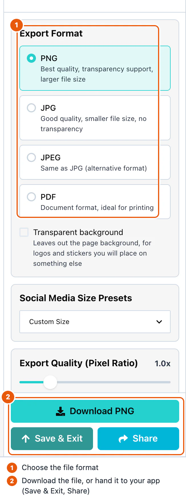
The panel opens with PNG selected, at the size of the page.
PNG
PNG keeps every detail, and it can have a transparent background. By default, the file has the size of the page in pixels: a 1080 × 1080 page gives a 1080 × 1080 file.
Export Quality (Pixel Ratio) makes the file larger than the page, from 0.5x to the largest value that stays within 6000 × 4000 pixels. At 2.0x, a 1080 × 1080 page gives a 2160 × 2160 file. For a 1080 × 1080 page, the largest value is 3.7x.
Social Media Size Presets export the page at a fixed size: Instagram Post (1080 × 1080), Instagram Story (1080 × 1920), Instagram Ad (1080 × 1080), Facebook Post (940 × 788), or Facebook Cover (851 × 315). The design is scaled to fit, and centered on a white background.
To change the page itself to one of these sizes, see Resizing.
Transparent background
Transparent background leaves out the page background, for logos and stickers that you place on something else. The option is for PNG, the only format with transparency. It is off when the panel opens.
The background is left out whether it is a color, a gradient, or a photo. Everything else stays in the file.
JPEG
JPG and JPEG both create a JPEG file. Only the file extension differs: .jpg or .jpeg. A JPEG file is smaller than a PNG file, and it has no transparency.
The pixel ratio and the size presets work as for PNG. The JPEG is saved at full quality.
PDF creates a print-ready file, with one PDF page for each design page. Print Quality sets the resolution:
| Option | DPI | Use |
|---|---|---|
| 300 | What commercial printers ask for. This is the default. | |
| Draft | 150 | Home printing, and posters seen from a distance. |
| Screen | 96 | Reading on a screen. The smallest file. |
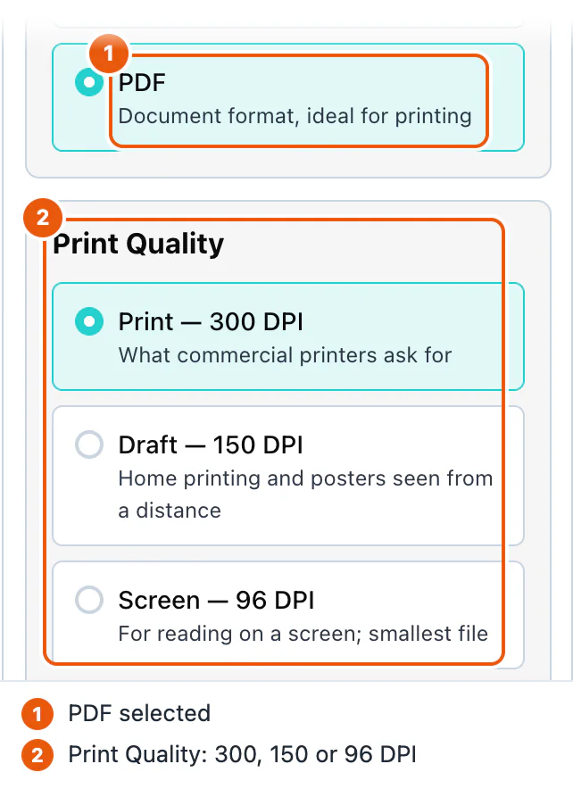
The PDF page keeps the shape of the design and fits A4: it is 210 mm wide, or 297 mm high when the design is tall. A 1080 × 1080 design gives a page of 210 × 210 mm. At 300 DPI, that page holds a picture of 2480 × 2480 pixels. At 150 DPI, 1240 × 1240. At 96 DPI, 794 × 794.
Each PDF page is a picture of the design page. The file name is canvas-export- followed by the date, for example canvas-export-2026-09-28.pdf.
Page selection
When the design has more than one page, Pages to export lists every page, all ticked. Untick the pages to leave out. At least one page must stay ticked.
| Format | One page | Several pages |
|---|---|---|
| PNG, JPEG | canvas.png or canvas.jpg | One ZIP file, canvas-pages- and the date, with page-1.png, page-2.png, and so on |
| A PDF with one page | One PDF with one page for each ticked page |
A ZIP file holds several pictures because a browser allows only one download for each click.
Handling the export
The three buttons at the bottom of the panel do different things:
| Button | Result |
|---|---|
| Download (for example Download PNG) | Saves the file on the user's computer. Your application is not called. |
| Save & Exit | Calls onExport(file) with the file in the selected format, then calls onClose. |
| Share | Asks for a name and an email address, then calls onExport(file, extras), with extras.email set to { to, name }. Then it calls onClose. |
onExport receives a File. Use file.type for the format, file.name for the name, and file.size for the size in bytes. Upload it to your server, as in the Export example. The editor does not send your email or share anything by itself: your code decides what Share means in your product.
The editor calls onClose without waiting for your upload. Keep the file upload running after you hide the editor.
Configuration
| Prop | Type | Default | Description |
|---|---|---|---|
onExport | (file: File, extras?: EditorExtras) => void | none | Receives the file after Save & Exit and Share. |
onClose | () => void | required | Called after Save & Exit and Share, and by the close button. |
The formats, the pixel ratio, and the PDF resolution are chosen by the user in the panel. They have no props.
Events
The custom element sends an export event with the file, and a close event. See Events.
Troubleshooting
Additional resources
Client-side rendering
The editor needs the browser: it draws on a canvas and reads the size of the page. On the server, the component has nothing to draw.
next/dynamic with ssr: false does two things:
- The server sends the page without the editor. The browser adds the editor after the page loads.
- The editor is loaded as a separate browser bundle. Next.js may preload it before the editor first renders. The historical Next.js 14 test measured 89.3 kB of First Load JS with this loader and 1.14 MB with a plain import; current sizes depend on your package and build.
Keep runtime SDK imports inside the browser-only loader. A 'use client' directive alone does not exclude module evaluation from server rendering. Type-only SDK imports are erased from the browser and server output.
App Router
In the App Router, pages and layouts are Server Components by default. A file becomes a client boundary when it starts with 'use client'. next/dynamic with ssr: false works only in a Client Component. So the file that loads the editor starts with 'use client', as in Usage.
To keep a page a Server Component, move the editor into its own file:
'use client';

import dynamic from 'next/dynamic';

const ImageEditor = dynamic(
  () => import('@layermetry/media-editor/react').then((mod) => mod.ImageEditor),
  { ssr: false },
);

export default function EditorClient() {
  return (
    <div style={{ position: 'fixed', inset: 0 }}>
      <ImageEditor
        licenseKey="YOUR_LICENSE_KEY"
        onExport={(file) => console.log(`Exported ${file.name}`)}
        onClose={() => console.log('The editor was closed')}
      />
    </div>
  );
}import EditorClient from './EditorClient';
export default function EditorPage() {
return <EditorClient />;
}Pages Router
The Pages Router supports server rendering and static generation. Load the editor with next/dynamic and ssr: false. The 'use client' directive is optional in this router.
'use client';

import dynamic from 'next/dynamic';

// Keep the editor out of server rendering and static generation.
const ImageEditor = dynamic(
  () => import('@layermetry/media-editor/react').then((mod) => mod.ImageEditor),
  { ssr: false },
);

export default function EditorPage() {
  return (
    <div style={{ position: 'fixed', inset: 0 }}>
      <ImageEditor
        licenseKey="YOUR_LICENSE_KEY"
        onExport={(file) => console.log(`Exported ${file.name}`)}
        onClose={() => console.log('The editor was closed')}
      />
    </div>
  );
}
For an upload endpoint in the Pages Router, use an API route under pages/api/.
Media utilities
Read metadata and create thumbnails before an upload or opening the editor. Import probeMediaFile and generateThumbnail from the package root, @layermetry/media-editor; they do not need a mounted editor. Run these examples in the browser. Codec support comes from the browser, regardless of your framework.
Probe media files
Call probeMediaFile(file) to inspect available container and track metadata without decoding frames.
| Field | Meaning |
|---|---|
container | Detected container, such as iso-bmff, webm, avi, or image; unknown when unrecognized. |
durationSec, durationSource | Optional duration and how it was found. Check durationSource before trusting precise timing; estimates are not exact measurements. |
video, audio | Optional tracks: dimensions/frame rate or channels/sample rate, with codec identifiers when available. |
sizeBytes | File size in bytes when available. |
undecodableReason | A warning for a container known to be unsupported. Its absence does not prove the browser can play or edit the file. |
The input accepts File, Blob, Uint8Array or ArrayBufferLike. Unrecognized contents return container: 'unknown' and durationSource: 'unknown' rather than rejecting because of file contents. Missing facts remain absent. The reader uses small byte windows and does not decode frames; it does not perform a full integrity or playback test.
MP4/MOV codecId and codec use decoder names, such as avc1.64002a and mp4a.40.2. WebM/Matroska codecId uses the container identifier, such as V_VP9 or A_OPUS; codec is present only when the mapping is known.
Generate thumbnails
Call generateThumbnail(file, options) to get a poster Blob or a user-facing reason when the file cannot produce a picture.
| Option | Default | Behavior |
|---|---|---|
at | 1 | Poster time in seconds. Negative values become zero; times past the end select the last picture. Ignored for still images. |
maxEdge | 400 | Whole-number longest edge, at least 16. Without box, output never grows beyond the source. |
format | 'image/jpeg' | JPEG, PNG or WebP. Read returned mimeType; the browser may produce a different format. |
quality | 0.82 | Compression from 0 to 1; ignored for PNG. |
box, fit | none, 'contain' | Exact positive-integer width/height. Overrides maxEdge and permits upscaling. contain fits with filled edges; cover crops to fill the box. |
frames | none | Positive integer count or { count, maxEdge }; frame maxEdge defaults to the poster setting. Ignored for still images. |
timeoutMs | 5000 | Positive deadline budget shared by the video poster and sampled frames. |
signal | none | AbortSignal for video decoding/sampling. Cancellation is a normal result with reasonCode: 'cancelled' rather than rejection. |
The result includes poster: Blob | null and info, the probe result. A successful poster includes width, height, mimeType and source display dimensions sourceWidth/sourceHeight, with video rotation or image EXIF orientation applied. A video's optional sourceTimeSec is the actual decoded time and can precede at; durationSec is absent when unknown.
For a positive known video duration, frames requests pictures at durationSec * (i + 0.5) / count. Successful frames[i] corresponds to frameTimesSec[i]. Fewer pictures can return when samples fail, the shared deadline expires or sampling is cancelled. Both arrays are absent if none succeeds, for still images, and for videos without a positive known duration.
When poster is null, show reason to the user and branch on reasonCode if needed. Keep detail in technical logs. Codes are unsupported-container, unreadable-file, no-video-track, no-decoder, unsupported-codec, decode-failed, image-undecodable, timeout, cancelled and encode-failed. Invalid options reject with RangeError before any bytes are read.
MP4, MOV, WebM and Matroska need a compatible browser video decoder. JPEG, PNG, GIF, WebP and AVIF use the browser image decoder; TIFF, SVG and HEIC may be recognized but refused. Recognition does not guarantee decoding. The current still-image path does not check the video deadline or abort signal, so retain stale-result guards for images too. Revoke poster/frame object URLs on replacement and unmount, as in the complete example.