

Layout and sizing
Size the video editor to its container and select the desktop or compact layout.
The editor has no fixed size. It fills the element that contains it, and it chooses its layout from the width of that element.
Container sizing
Give the container a size, and the editor fills it. With the React component, width and height set the size of the box that the component renders. A number is pixels, and a string is any CSS size.
<VideoEditor licenseKey="YOUR_LICENSE_KEY" onClose={handleClose} width={1200} height="80vh" />Default: 100% for both, so the box is as large as its parent.
The custom element and mountVideoEditor take their size from the element, as any block element does. They also accept width and height options, which size the editor inside the element:
<!doctype html>
<html lang="en">
  <head>
    <meta charset="utf-8" />
    <title>Video editor</title>
  </head>
  <body>
    <media-editor-video id="editor" style="position: fixed; inset: 0; background: #e5e7eb"></media-editor-video>
    <script type="module">
      import '@layermetry/media-editor';

      document.getElementById('editor').props = {
        licenseKey: 'YOUR_LICENSE_KEY',
        onClose() {},
        // The size of the editor inside the element.
        width: 1200,
        height: 700,
      };
    </script>
  </body>
</html>
The editor measures its container continuously. When the container changes size, the editor fits the canvas to the new size.
Compact layout
When the container is narrower than 768 pixels, the editor uses its compact layout for phones. The tool rail becomes a dock at the bottom, and tools open as sheets.
import { VideoEditor } from '@layermetry/media-editor/react';

export default function App() {
  return (
    <div style={{ display: 'flex', justifyContent: 'center', padding: 24, background: '#e5e7eb' }}>
      <VideoEditor
        licenseKey="YOUR_LICENSE_KEY"
        onClose={() => console.log('The editor was closed')}
        // 390 pixels wide: narrower than 768, so the editor uses the compact layout.
        width={390}
        height={844}
      />
    </div>
  );
}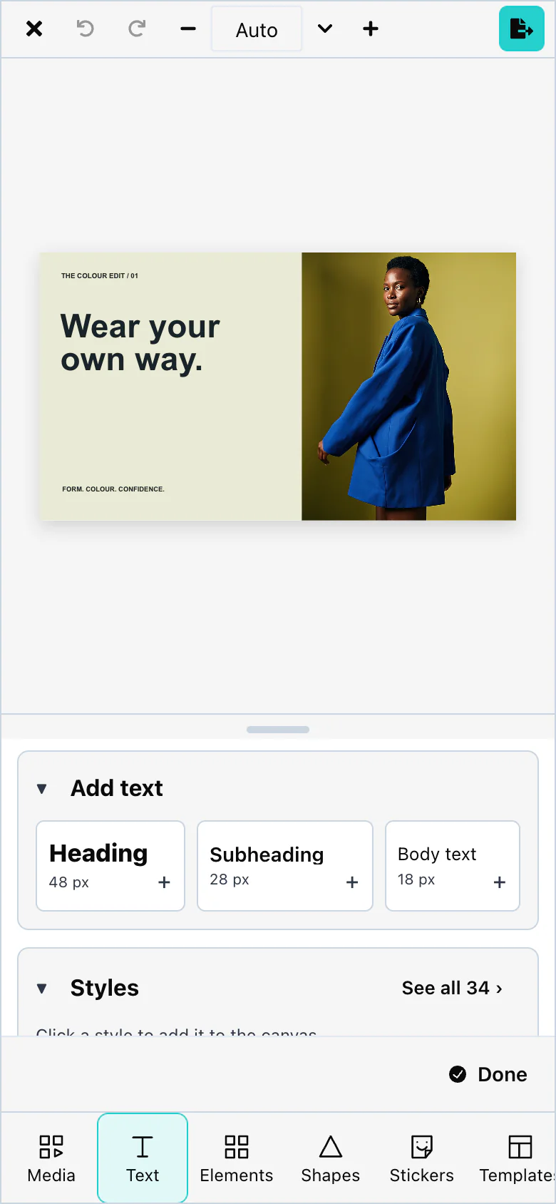
The layout depends on the container, not on the browser window. An editor in a narrow side panel on a desktop screen also uses the compact layout.
In the compact layout, the editor uses the dark theme unless you pass darkMode. See Light and dark mode.
A selected item shows a small menu of its most important actions. itemActions changes that menu. See UI customization.
Default: compact below 768 pixels, regular from 768 pixels.
Fullscreen mode
The editor has no full screen button of its own. To show it on the whole screen, call the browser's requestFullscreen() on the container:
import { useRef } from 'react';
import { VideoEditor } from '@layermetry/media-editor/react';

export default function App() {
  const box = useRef<HTMLDivElement>(null);

  return (
    <main>
      <button onClick={() => box.current?.requestFullscreen()}>Full screen</button>
      <div ref={box} style={{ width: 960, height: 600, background: '#fff' }}>
        <VideoEditor licenseKey="YOUR_LICENSE_KEY" onClose={() => document.exitFullscreen()} />
      </div>
    </main>
  );
}
The browser allows full screen only after a click or a key press by the user. The editor fits itself to the screen, and back to the container when full screen ends.
To fill the browser window without full screen, give the container position: fixed and inset: 0, as in the Quickstart.
Default: the editor stays inside its container.