

Stickers and GIFs
Add static and animated stickers.
Stickers are small ready-made pictures. The editor has a built-in set, and you can add GIPHY, your own collections, or your own sticker service. Each collection is a source in the stickers prop.
Setup
The built-in stickers work with no setup. This example adds a collection of your own and GIPHY:
import { ImageEditor, builtInStickers, giphyStickers, staticStickers } from '@layermetry/media-editor/react';

// Your own stickers. Each picture must allow cross-origin requests.
const brandStickers = staticStickers({
  id: 'brand',
  label: 'Our brand',
  items: [
    { id: 'badge', title: 'Brand badge', url: 'https://media.example.com/giphy/still1.png', width: 200, height: 200 },
    { id: 'spinner', title: 'Moving dot', url: 'https://media.example.com/giphy/moving1.gif', width: 200, height: 200 },
  ],
});

export default function App() {
  return (
    <div style={{ position: 'fixed', inset: 0 }}>
      <ImageEditor
        licenseKey="YOUR_LICENSE_KEY"
        onClose={() => console.log('The editor was closed')}
        stickers={{
          sources: [builtInStickers(), brandStickers, giphyStickers({ endpointUrl: 'https://api.example.com/giphy' })],
        }}
      />
    </div>
  );
}
Built-in stickers
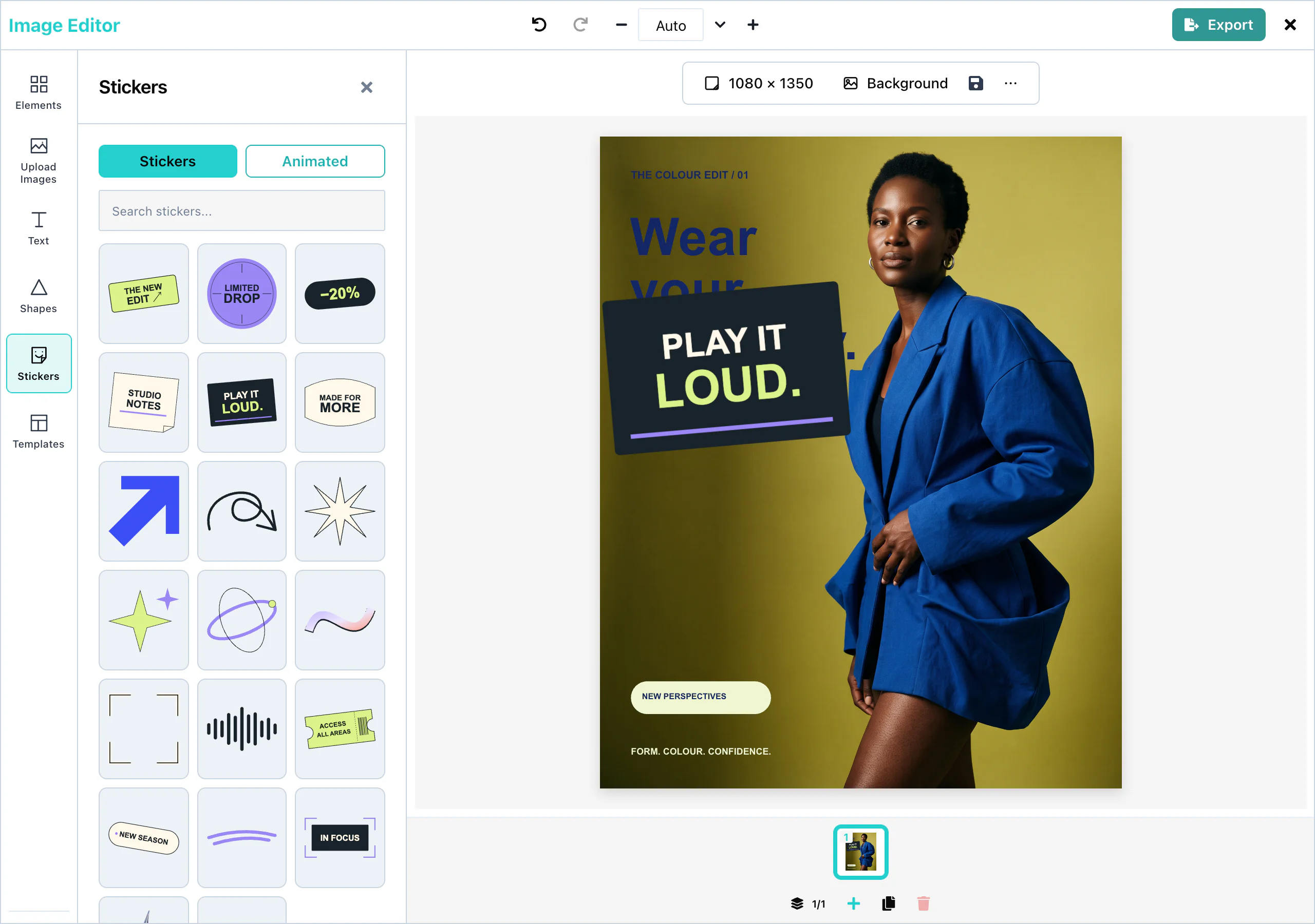
Open the Stickers panel in the tool rail. Without the stickers prop, it shows the built-in collection Essentials: Heart, Star, Sparkle, and Check mark. They are drawings inside the package, so they load with no network request.
 View full size
A click on a sticker adds it to the page. When there is more than one source, a row of source names appears under the tabs. The search field searches the source that is selected.
When you pass stickers, list builtInStickers() yourself if you want to keep the built-in collection. stickers={{ sources: [] }} removes the Stickers tool from the editor.
GIPHY
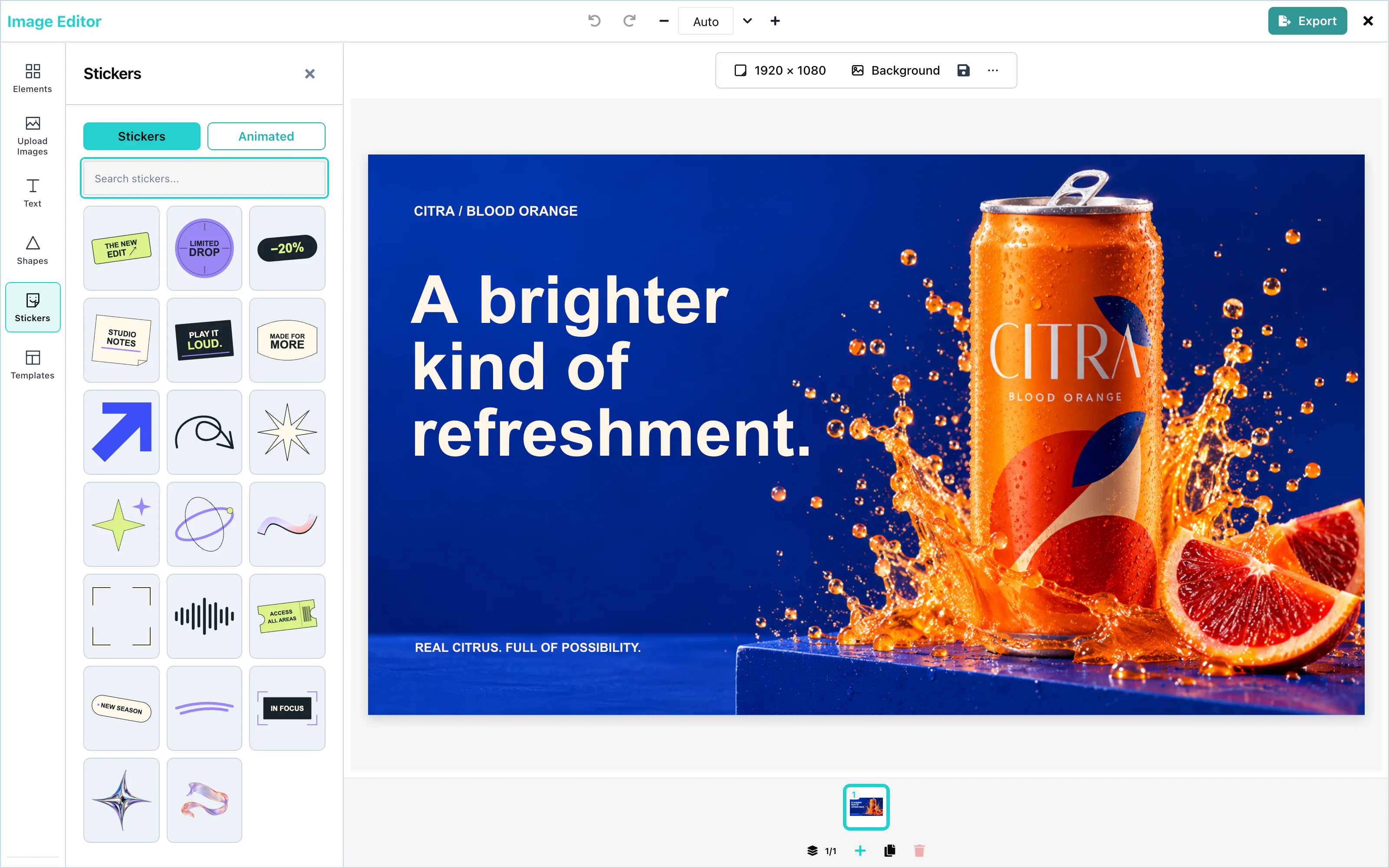
giphyStickers() adds the GIPHY sticker library as a source. Before the user types, it shows the trending stickers. Results arrive 24 at a time, and Load more shows the next 24.
import { ImageEditor, builtInStickers, giphyStickers } from '@layermetry/media-editor/react';
export default function App() {
return <ImageEditor
licenseKey="YOUR_LICENSE_KEY" onClose={() => console.log('Editor closed')}
stickers={{ sources: [builtInStickers(), giphyStickers({ endpointUrl: 'https://api.example.com/giphy' })] }}
/>;
} View full size
GIPHY content is rated pg.
Animated GIFs
The Animated tab shows the stickers that move. A sticker moves on the page when it comes from this tab.
A sticker from the Stickers tab is still. The editor adds the first frame of the picture.
For a GIPHY sticker to appear on the Animated tab, its moving version must be 4 MB or smaller. Larger stickers appear on the Stickers tab only.
PNG, JPEG, and PDF files cannot move. An export holds one frame of each moving sticker.
Custom sticker packs
staticStickers() turns a list of pictures into a source:
import { staticStickers } from '@layermetry/media-editor/react';

const brandStickers = staticStickers({
  id: 'brand',
  label: 'Our brand',
  items: [
    { id: 'badge', title: 'Brand badge', url: 'https://media.example.com/badge.png', width: 200, height: 200 },
    { id: 'spinner', title: 'Moving dot', url: 'https://media.example.com/dot.gif', width: 200, height: 200 },
  ],
});
The search field finds a sticker by its title or its id. A .gif or .webp picture appears on the Animated tab too.
Each sticker item has these fields:
| Field | Type | Description |
|---|---|---|
id | string | Unique in the source. |
title | string | The name. It is shown to screen readers as "Add" and the title. |
url | string | The picture. It must allow cross-origin requests. |
animatedUrl | string | A moving version, for the Animated tab. |
thumbnailUrl | string | A small picture for the panel. Default: url. |
width, height | number | The size in pixels on the page. |
Your own sticker service
A source is an object with id, label, and a search function. trending is optional: without it, the source shows nothing until the user types.
import type { StickerSource } from '@layermetry/media-editor/react';

const companyStickers: StickerSource = {
  id: 'company',
  label: 'Company',
  async search(query, { limit, offset }, signal) {
    const url = `/api/stickers?q=${encodeURIComponent(query)}&limit=${limit}&offset=${offset}`;
    const response = await fetch(url, { signal });
    const { items, total } = await response.json();
    return { items, hasMore: offset + items.length < total };
  },
};
search receives limit 24 and an offset that grows by 24 with each Load more. It returns { items, hasMore }. Each source keeps its own results. The editor never mixes the results of two sources.
Generated stickers
Enable ai.sticker to generate transparent picture stickers.
import type { EditorAIConfig } from '@layermetry/media-editor';

export const ai: EditorAIConfig = {
  endpointUrl: '/api/ai',
  sticker: {
    style: { options: ['Flat', 'Line art', 'Clay'], defaultValue: 'Flat', allowCustom: false },
    promptTemplate: 'a sticker of {subject}, {style}, centred, on a transparent background, no text',
    count: { options: [1, 2, 4], defaultValue: 2 },
    size: '1024x1024', quality: 'low',
    outline: { width: 4, color: '#ffffff' },
    transparencyCheck: true, maxPerSession: 10,
  },
};
Sticker generation has its own models, transport and session limit. image: false does not disable it. sticker: false does not disable pictures.
Defaults
Omitted sticker settings retain these defaults.
| Setting | Default | Host control |
|---|---|---|
| Style | Cartoon, 3D, Flat, Cute (kawaii), Pixel art; Cartoon selected. | style: { options, defaultValue, hidden, fixed, allowCustom } or style: false. |
| Wording | a sticker of {subject}, {style}, centred, on a transparent background, no text. | promptTemplate must include {subject}; {style} is optional. |
| Count | 2 results from choices 1, 2, 3 and 4. | count: { options, defaultValue, hidden, fixed }; values are whole numbers from 1 to 4, because the editor shows at most four results. A model field bound to count has the same limit. |
| Size and quality | 1024x1024, low, transparent background. | size and quality apply to the built-in request builder. |
| Outline | White, 4% of the shorter side. | outline: { width, color } or outline: false. |
| Transparency check | Enabled. | transparencyCheck: false skips the edge check. |
| Placement | A picture item with an outline. | Choose a result and select Add to canvas. |
| Photo input | Unavailable. | This release generates from a subject; it does not create stickers from a photo. |
Style accepts typed values of at most 60 characters by default. Set allowCustom: false for a closed list, or fixed: true for one style. style: false removes the choice and its prompt wording. Hidden choices use their defaults; fixed choices refuse another value. Both retain the resolved values in the summary.
Prompt templates accept at most 500 characters. promptTemplate: '{subject}' sends the user’s subject unchanged. The style remains in input.style. On the classic route, options.count and options.n carry the same count.
Model settings
A model field bound to count replaces the built-in Results control.
import { defineGenerationModel, type EditorAIConfig } from '@layermetry/media-editor';

const stickerModel = defineGenerationModel({
  label: 'Cut-out stickers', operation: 'sticker',
  fields: [
    { name: 'n', label: 'Results', type: 'number', integer: true, min: 1, max: 4, defaultValue: 2, bindTo: 'count' },
    { name: 'size', label: 'Size', options: ['1024x1024'], defaultValue: '1024x1024', fixed: true },
    { name: 'quality', label: 'Quality', options: ['low'], defaultValue: 'low', hidden: true, fixed: true },
    { name: 'background', label: 'Background', options: ['transparent'], defaultValue: 'transparent', hidden: true, fixed: true },
  ],
});
export const ai: EditorAIConfig = { endpointUrl: '/api/ai', sticker: { models: [stickerModel] } };
With custom models, ai.sticker.size and ai.sticker.quality are refused. Describe those provider settings in model fields instead. The model returns { items: [{ url: "https://cdn.example.com/sticker.png" }] }. With custom classic providers, put size and quality in buildRequest instead.
The built-in size choices are 1024x1024, 1536x1024, 1024x1536 and auto. Quality choices are low, medium, high and auto. Your server must implement those settings; the SDK does not call a provider directly. The built-in size and quality are not summary fields. Describe them as model fields when users need to see them before generation.
Outline
The editor draws the outline around transparent picture edges. Thickness is 0–25% of the shorter side and color is #rrggbb. Users can change it in Effects. Preview and exported files include it.
An outline cannot extend beyond the picture boundary. Animated GIFs are not outlined.
Transparency
The edge check detects a visible background after a result loads. Remove background uses your mediaApiUrl background-removal route. A failed removal or an unreadable replacement keeps the original sticker.
The check needs CORS permission to read pixels from another origin. It reports when it cannot check. Known JPEG addresses are refused because JPEG cannot preserve transparency. Other image formats can still contain an opaque background; the host owns the result’s transparency.
Generated list
Results remain in the session’s Generated list. A chosen sticker is placed as a picture with normal move, resize and Undo behavior.
Configuration
| Prop or export | Description |
|---|---|
stickers | { sources: StickerSource[] }. Default: the built-in collection. { sources: [] } removes the Stickers tool. |
builtInStickers() | The built-in collection Essentials. |
giphyStickers(options) | GIPHY. Options: one of apiKey, endpointUrl, or requestFn, and id and label. See Stock media. |
staticStickers({ id, label, items }) | A fixed list of pictures. |
The three functions are exported from both @layermetry/media-editor and @layermetry/media-editor/react.
Events
Stickers have no events of their own. They are part of the design, and they reach you in the exported file through onExport. See Events.