

Layout and sizing
Size the image editor to its container and select the desktop or compact layout.
The image editor fills the element that contains it. It picks its layout from the width of that element, not from the width of the browser window.
Container sizing
Give the container a width and a height. The editor measures it, and follows every later change of its size.
<ImageEditor
  licenseKey="YOUR_LICENSE_KEY"
  onClose={() => setIsOpen(false)}
  width={1200}
  height={800}
/>
In React, width and height set the size of the box that the component renders. A number is in pixels, and a text value is any CSS size, such as '100%' or 'calc(100vh - 64px)'. The default is 100% for both, so the editor fills its parent.
The custom element is a block. Size it with CSS, like any other element.
Compact layout
When its container is narrower than 960 pixels, the editor switches to its compact layout. It switches back when the container is 960 pixels or wider. This happens by itself, with no option.
The compact layout has:
- a top bar with Close, Undo, Redo, zoom, and Export;
- the page under it, and the page list under the page;
- a dock at the bottom with eight tools: Media, Text, Elements, Shapes, Background, Effects, Resize, and Templates.
A tool opens in a panel above the dock. Drag the panel up to make it taller, or down to close it. When the user selects something on the page, the dock shows the actions for the selection instead.
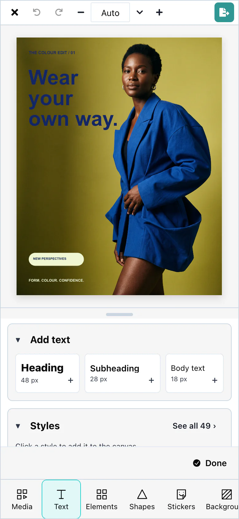
To show the compact layout, give the editor a narrow container:
<media-editor-image id="editor" style="width: 390px; height: 844px; margin: 28px auto"></media-editor-image>Fullscreen mode
The editor has no full-screen button. To show it on the whole screen, call the browser's Fullscreen API on the element that contains it. The editor follows the new size.
<!doctype html>
<html lang="en">
  <head>
    <meta charset="utf-8" />
    <title>Image editor</title>
  </head>
  <body>
    <button id="fullscreen">Full screen</button>
    <media-editor-image id="editor" style="height: 600px"></media-editor-image>

    <script type="module">
      import './node_modules/@layermetry/media-editor/dist/embed.modern.js';

      const editor = document.getElementById('editor');
      editor.props = {
        licenseKey: 'YOUR_LICENSE_KEY',
        onClose() {
          if (document.fullscreenElement) document.exitFullscreen();
        },
      };

      // The browser's Fullscreen API. The editor follows the new size of its element.
      document.getElementById('fullscreen').addEventListener('click', () => {
        editor.requestFullscreen();
      });
    </script>
  </body>
</html>
To fill the browser window without the Fullscreen API, place the container with position: fixed; inset: 0.